
What is pop art?
Pop art is a way of working that treats advertisements, packaging, comics, and ordinary consumer goods as legitimate subject matter. The term belongs with the Independent Group in Britain in the 1950s and with artists working in the United States in the early 1960s. The aim is a harder look at images people already know by heart.
No single technique owns it. Collage, silkscreen, dots borrowed from cheap printing, and sculpture built from the shape of a common object all sit in the same conversation. What they share is the visual language of mass culture, handled with wit, affection, and a cool distance.
The phrase now covers almost any cheerful interior. The historical term is narrower. The sequence of years sits in the essay on how pop art traveled from the 1950s. This page stays with the definition.
Where the name settled
The name is tied to talk around the Independent Group, a London circle of artists, critics, and architects. Richard Hamilton’s 1956 collage Just what is it that makes today's homes so different, so appealing? was made for the This Is Tomorrow exhibition at the Whitechapel Gallery. It inventories a modern interior: a bodybuilder, a lamp, a canned ham, a comic cover, a tape recorder.
The collage does not argue in a paragraph. It argues by arrangement. The home, in this picture, is already a public place.
Magazines, packaged food, and machines have moved in. Hamilton leaves the crowd intact so a viewer can see the new density of ordinary life.
Eduardo Paolozzi and Richard Hamilton are the names most often placed at that British beginning. They watched American magazines, science fiction, and advertising redraw desire. Across the Atlantic, the early 1960s made the same interest more graphic and more public. Andy Warhol and Roy Lichtenstein became the faces of that moment, which is why their methods still stand in for the whole story in casual talk.
What the work actually brings forward
Pop art pays attention to repetition. A soup label, a comic panel, a celebrity face: these pictures were designed to be seen again and again. Artists borrowed that logic.
Warhol’s silkscreens make the repeat visible as a method. Lichtenstein’s Ben-Day dots enlarge a cheap printing pattern until you can see the screen that carried the image.
Color here is often commercial color. It is flat, named, and confident: the red of a package, studied as a package. That flatness can hold irony and tenderness in the same breath. People call the movement cool.
Cool, in this case, means a controlled tone. Feeling is still in the work. It has simply refused the drama of the loaded brush as its main event.
Scale changes the body’s job. A panel you once read at arm’s length, blown up, asks you to stand where you would stand for a history painting. That shift in distance is part of the meaning. At domestic scale the question remains: how close should the image come, and how much air does it need in order to stay legible?
Several names, not one style
Warhol (1928–1987) used silkscreen. Campbell's Soup Cans is 1962. The Marilyn silkscreens followed, running a publicity photograph through color until the face became both a public image and a surface. Lichtenstein (1923–1997) used Ben-Day dots and comic-derived imagery.
Look Mickey, Whaam!, and Drowning Girl are the paintings people usually mean. He did not invent the dots. He isolated a printing habit and gave it the size of painting.
Other artists keep the map honest. Claes Oldenburg made soft and monumental versions of ordinary things. James Rosenquist brought billboard cropping into painting. Tom Wesselmann stayed with the still life and the nude, rebuilt from the language of ads.
They did not work as a committee. Pop art is a shared set of interests, not a uniform.
Warhol’s method has its own page, because one signature swallows the term too easily. The methods sit side by side: repetition of a print, enlargement of a comic dot, the bulk of a common object. Reading the term that way makes it harder to mistake pop art for a poster with a bright border.
Mix-ups that linger
One mix-up treats pop art as a synonym for anything people like. A popular song is not pop art. A poster of a film star stays a poster unless someone has made a work that thinks about that image as an image.
The subject can be popular. The work is still a decision about form.
Another mix-up files the whole story under New York. The British conversation is earlier, and its temperature is different. A third assumes bright color is enough.
Plenty of loud rooms have nothing to do with the movement, and some pop works are restrained in palette. The color earns the name when it comes out of commercial speech.
A fourth mix-up drops graffiti, designer toys, and pop art into one drawer. They can share a love of familiar characters. They are not the same practice. Popular culture in art is the cleaner place to sort that overlap.
The material may rhyme. The agreement about what the work is doing does not.
A practical eye at home
At home, borrow the discipline rather than the volume. Choose one image or one silhouette people already recognize, then give it air. A busy wall turns the object into noise. A quiet wall lets commercial color, or a comic pattern, do the work it was built to do.
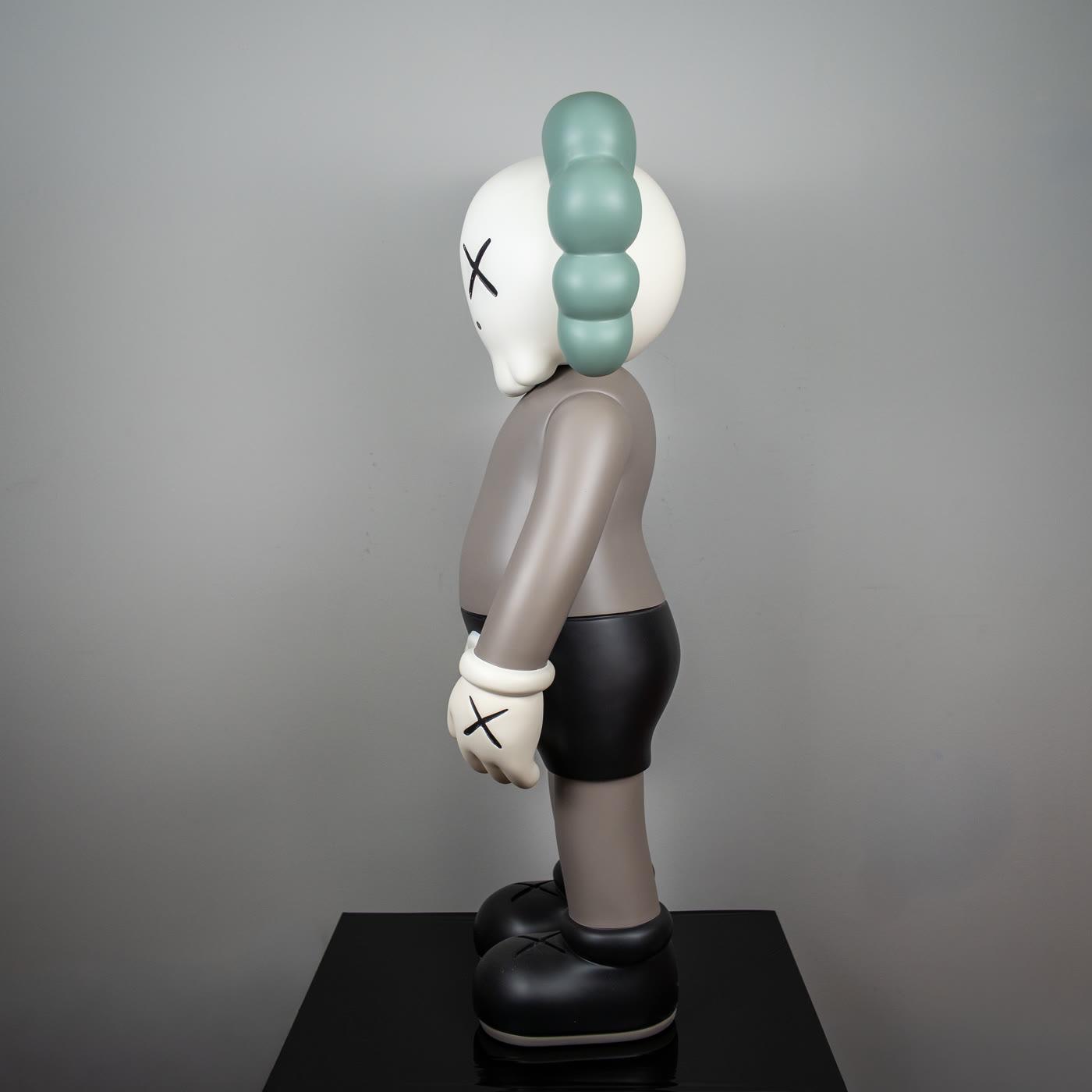
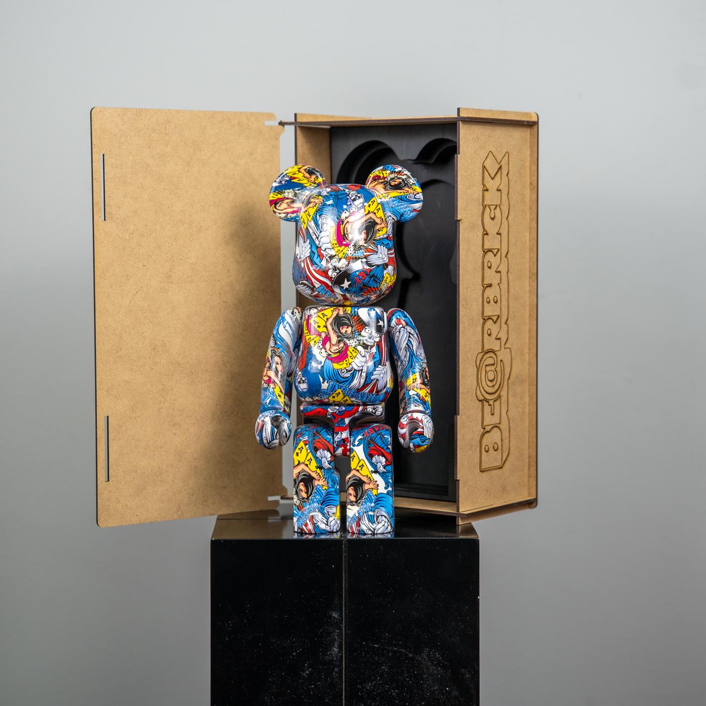
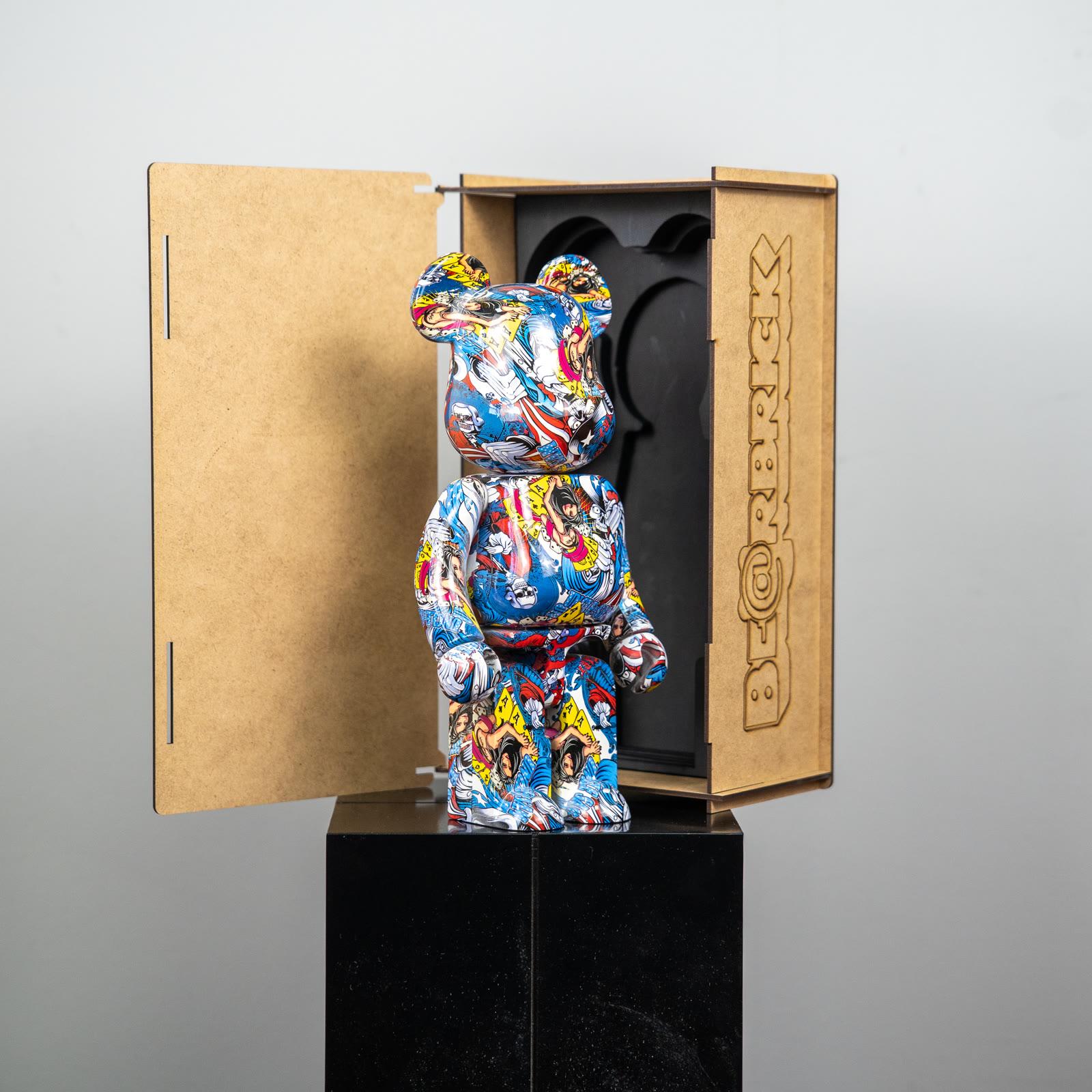
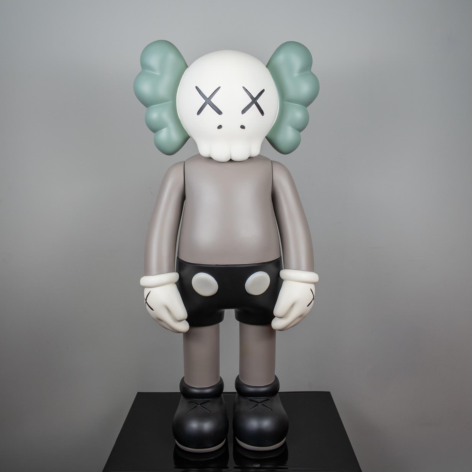
Two objects in this collection show the range without asking a room to become a shop display. The Companion with sage ears and a taupe body reduces a familiar character to a calm stance and a narrow palette. The comic-print bear carries printed energy in a compact body.
Neither needs a speech. Each needs a surface, a little distance from the next thing, and light that keeps the form from going flat.
The object selection is enough if you want to compare finishes before anything is placed. You do not need the entire movement on one shelf. The lesson about repetition works when the repeat is intentional: one form, a change of color, a readable interval.
Casual accumulation is a different habit. At home, pop art shows up as a few clear decisions and a measured gap.
A short closing
If the definition is enough, stop here. The order of years is in the journey piece. If one name is pulling you, the Warhol page is the next stop. For a wider look at how comics, goods, and characters entered art, the essay on popular culture stays open.
For a short museum glossary, the Tate glossary of pop art (https://www.tate.org.uk/art/art-terms/p/pop-art) and MoMA (https://www.moma.org/collection/terms/pop-art) are steady public pages. We are not citing a study. We are pointing at two places that keep the term in plain institutional language.