
What is Warhol’s place in pop art?
Andy Warhol’s place in pop art is to make repetition itself the work. He took images already moving through the culture, soup labels and a publicity face among them, and printed them until the printing was as visible as the subject. Fame is the topic. The method leaves the manufacture of that fame on the surface.
Warhol was born in 1928 and died in 1987. The path from commercial drawing into painting is often told. This page does not collect studio legend.
It keeps what can be said plainly: silkscreen, Campbell's Soup Cans in 1962, and the Marilyn silkscreens that followed. The wider frame is in what pop art is.
It is easy to let him stand for the whole movement, because the face and the method traveled so far. Lichtenstein opens another door by enlarging the printed dot. They are neighbors.
They do not repeat the same gesture. Lichtenstein and comics holds that difference.
Why silkscreen matters
Silkscreen comes from a stencil’s repeat more than from paint behaving like handwriting. The same image can be pulled again and again. Small shifts, ink differences, and changes of color keep each pull from being a perfect twin.
Warhol does not hide that mechanical closeness. He makes it the subject.
Uniqueness of the hand stops being the main event. The surface is still not a blind copy. As color stacks, a face or a can stays recognizable and becomes a graphic plane. Looking moves between knowing the product and seeing the print.
That is why his relation to pop culture is not a fan poster. He takes images produced by the market, the publicity still, and the magazine, and he shows that they were designed to be multiplied. How popular culture becomes material is the wider version of the gesture. Warhol is its clearest example in print.
Soup cans and Marilyn
Campbell's Soup Cans is 1962. A can is an ordinary unit of a kitchen shelf. Warhol makes it a unit of painting. The label stays readable.
The repeat recalls a shop aisle. What is raised up is not the taste of soup. It is the fact that a familiar package already has a form clear enough to be a subject.
The Marilyn silkscreens follow that body of work. A publicity photograph passes through layers of color. The face remains a person people know, and it becomes a printing surface at the same time.
Mouth, eyes, and hair separate in high contrast. As the color changes, the emotional temperature changes, while the coolness of the source photo stays.
Read together, the two examples show the culture he chose. One is a grocery good. The other is a star image.
Both were in circulation before they were art. Both become monumental through repeat. The monument here is not marble weight. It is multiplication.
You have seen that face, or that label, already. The work is about that already.
Color as a decision
Warhol’s colors do not behave like mixtures coaxed from a landscape. They behave like commercial color: flat, nameable, bold. Pink, turquoise, or a hard red across a face is a decision of the print more than a portrait of a mood.
Mood is still readable. Its source is the choice of color, not the flourish of a brush.
Repeating one image in different colors shows that there is no single correct state. A Marilyn in one pink and a Marilyn on a colder ground are both Marilyn. The face does not vanish when the color changes.
The surface does. That is why repetition, in this art, is a finer matter than the charge of mere copying.
At home the lesson stays modest. You do not need a wall of color trials. One saturated color on a quiet ground is a distant cousin of that economy: a small number of units, a clear decision, repetition kept as a possibility. Possibility does not require ten copies on a shelf.
Mix-ups about Warhol
The first mix-up is that he only copied. The source images belong to other hands. That is true. The work is in choosing the source, setting its scale and color, and leaving the repeat visible.
The difference between a copy and a method sits there. Hiding the source was never the point.
The second mix-up treats pop art as Warhol alone. He is the name that traveled furthest. The early British collages, Lichtenstein’s dots, and Oldenburg’s objects are other doors. One name narrows the term.
The third mix-up treats every commercial product downstream as part of that art. The method does not pass automatically onto every can on a shelf.
The fourth mix-up is emptiness of feeling. The tone is controlled. Marilyn’s makeup is already a mask.
Warhol does not break the mask. He multiplies it in color. Coolness is not vacancy. It is a distance in the looking.
That distance does not sneer at popular culture. It looks closely at how the culture is produced.
One saturated color, a quiet ground
Using Warhol at home is not a row of soup labels on the wall. The sturdier lesson is to set one saturated color against a quiet ground, and to use repetition only when the interval is real. Red is a clear test.
It can shout. With space beside it, it simply stays.
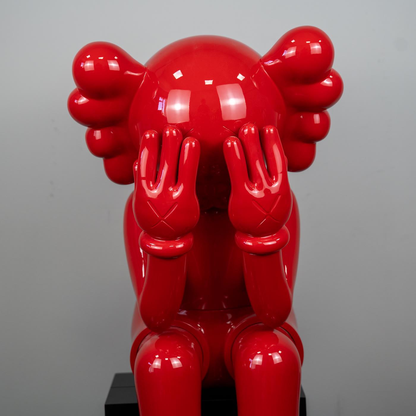
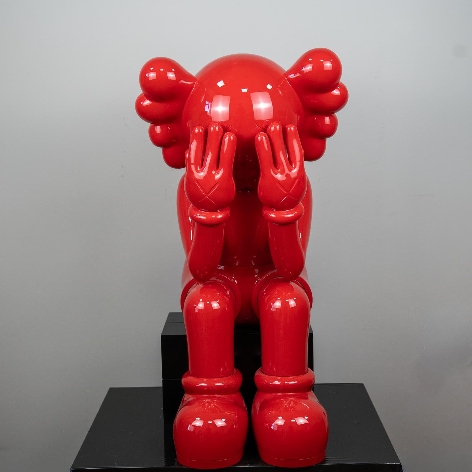
The glossy red Passing Through figure, seated with hands over the face, gathers that color into one body. The gesture is closed. The color is open.
In a room it recalls the same economy: one decision, one surface, and quiet around it.
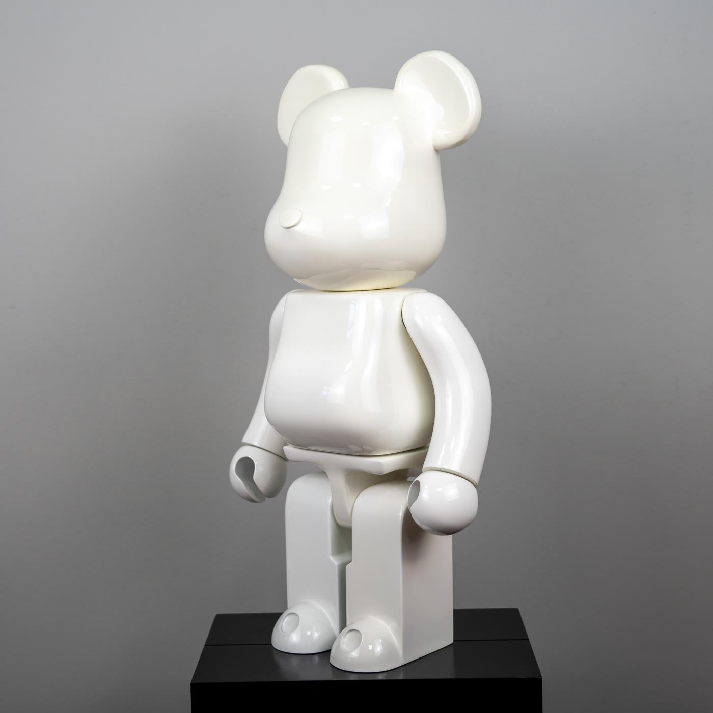
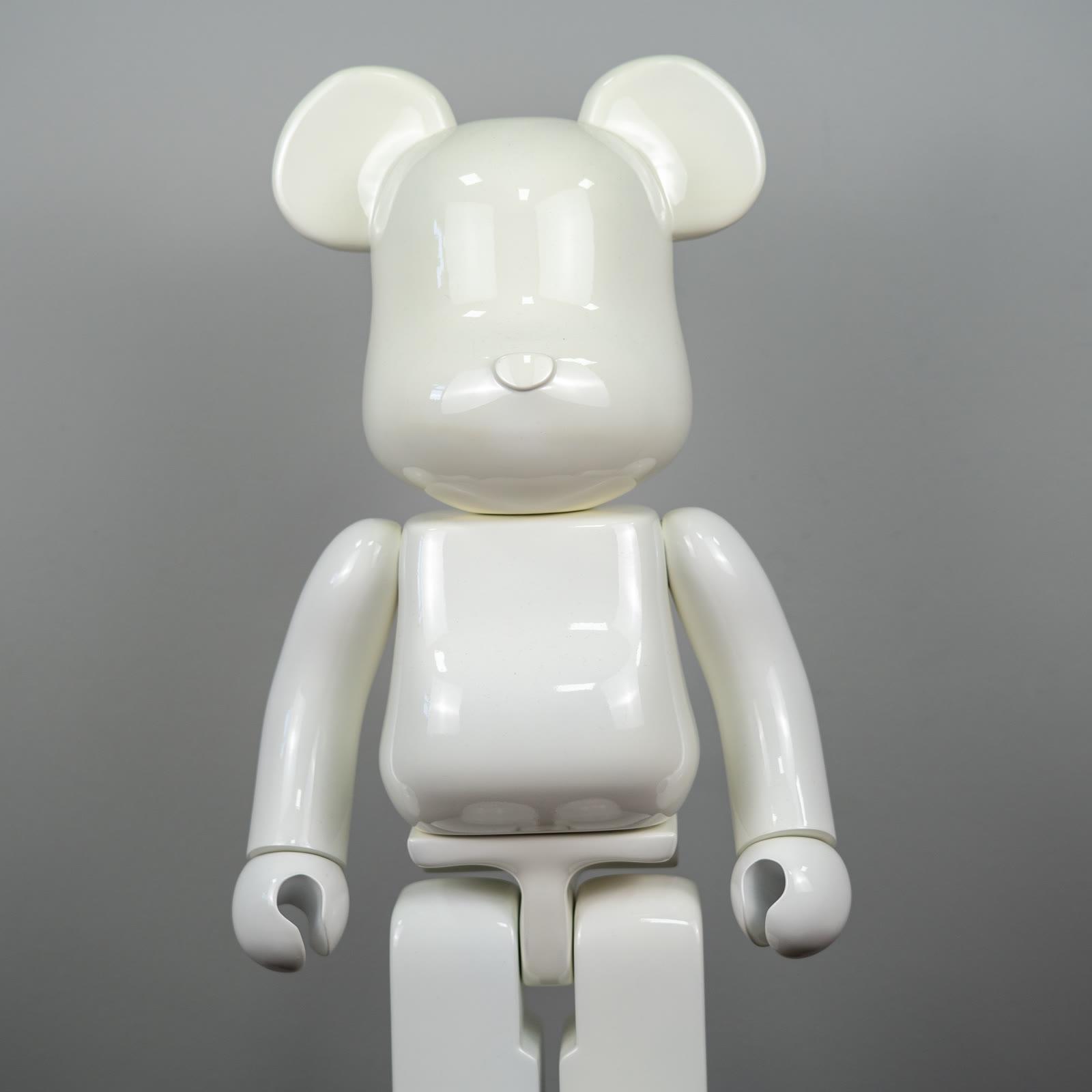
The glossy white bear holds the other end. White gives saturated color somewhere to breathe. They do not need to share a crowded shelf. One can be the sentence in red.
The other can act as a blank page. The selection is enough for comparing finishes. If a hard highlight flattens the gloss, turning the light a little to the side brings the form back.
A short closing
Warhol takes popular culture as a subject and refuses to hide the repeat of the print. The soup cans, in 1962, are the grocery version of the method. The Marilyn silkscreens are the face version. Both ask you to reread something familiar from inside its multiplication.
The definition page keeps the term wide. The Lichtenstein page opens the other great graphic door. The essay on popular culture looks past the star and the package toward shared images in general. At home, one saturated color is the calmest summary of this history.