

Why did Lichtenstein enlarge the comic?
Roy Lichtenstein enlarged the comic panel so the language of cheap printing could be read at the distance of a painting. A speech balloon, a heavy contour, and a mechanical dot disappear into the page when you hold it in your hands. At the size of a canvas, the same parts stand as a style. Enlargement is less a tribute to one frame than a way of showing how that frame was printed.
Lichtenstein was born in 1923 and died in 1997. His place in pop art is separate from Warhol’s silkscreen. Warhol multiplies a repeat.
Lichtenstein enlarges a single frame until the trace of printing can be picked out. The two methods can sit beside each other, in the Warhol essay and here, without becoming one sentence.
The general frame of the term is in what pop art is. This page stays at the comic door. The source panels belong to other draftsmen.
Lichtenstein does not hide them. He makes a decision about contour, dot, and crop.
What the Ben-Day dot is doing
The Ben-Day dot is a regular pattern used in commercial color printing to build tone. Up close, the dots stay separate. From far away, they mix into a color. Newspapers and comics relied on that economy for a long time.
Lichtenstein does not add the dot as decoration. He enlarges it until a painting can count it.
Once enlarged, the dot does two jobs. It reminds you that the source was cheap print. It also keeps the surface from behaving like a handmade window. You do not fall into a scene.
You look at a printing order. That distance matches the controlled tone of pop art.
Spreading the same dot over any photograph, like a filter, does not repeat the gesture. Lichtenstein’s work is which frame he chose, how he simplified the contour, and at what scale he left the dot. A filter does not stand in for a decision. Pattern neighbors this history only when its intervals can still be read.
Three works, three readings
Look Mickey is an early step into comic language. Mickey and Donald share the picture, and speech, contour, and dots appear together. The subject is a pair of figures people know from childhood.
The event is that those figures still look printed once they occupy a painting. Charm does not get ahead of the method.
Whaam! carries a fighter plane and an explosion up to a large scale. Sound is written as letters. The blast stays a graphic convention of the comic. It does not become a naturalistic cloud of smoke.
The two-part layout walks the eye from left to right, from cause toward impact. The noise is, in fact, a very orderly composition.
Drowning Girl builds the feeling of a romance comic through a figure in the water and a thought balloon. The drama is large. The surface is calm and dotted. Emotion and printing method are readable at once.
Lichtenstein does not leave the tear as a private confession. He shows it as a gesture the genre already knew. Together, the three works say that humor, violence, and feeling can pass through the same printed language.
What happens when pattern changes scale
Moving from a small dot to a large dot is not the same pattern continued. The gap grows. The eye sees color as an order, not as a stain.
That is the comic version of pop art’s question about scale. A wider account sits in color, scale, and repetition.
At domestic scale the lesson speaks more quietly. A comic print across a figure’s body is not a wall-sized painting. Up close, dot and contour should still separate.
Too far away, the object reads only as a bright toy. Too close, on a crowded shelf, the pattern mixes with whatever is shouting beside it.
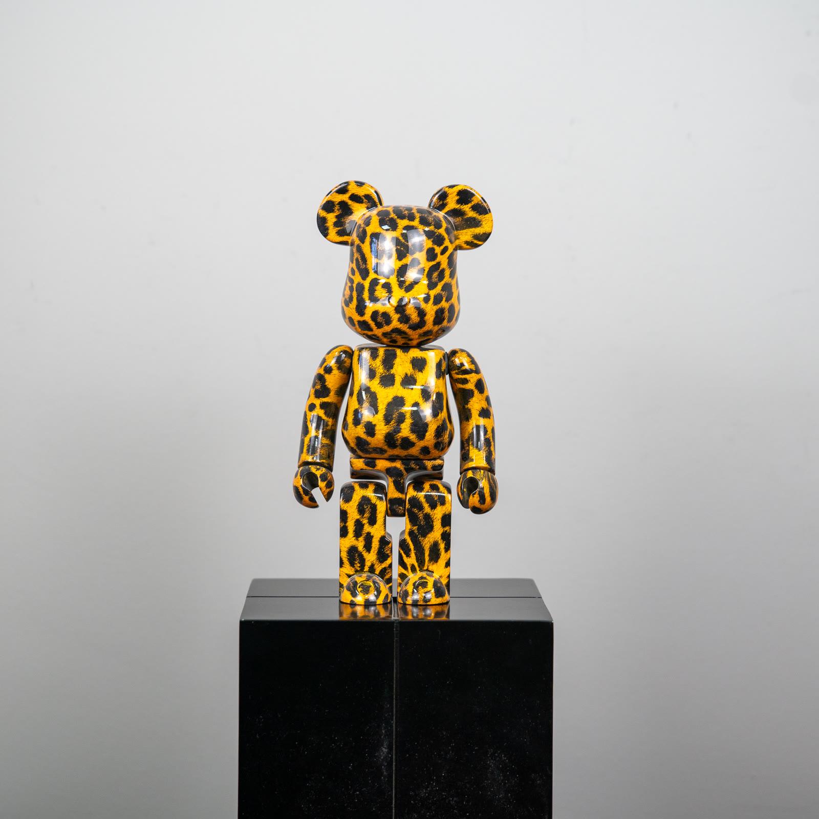
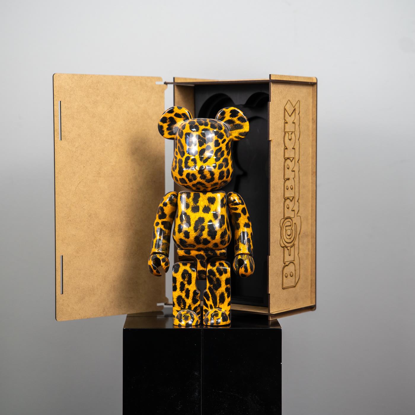
Animal print is a different cousin of printing. A leopard spot is also a color from far off and a repeated unit from nearby. It is not the same gesture as a comic dot.
Both say the surface is carrying an order. That neighborhood can be set up in a room without turning the room into a theme.
Points that get tangled
The first tangle is that Lichtenstein copied comics without thinking. The source is another artist’s panel. The painting chooses that panel, simplifies it, and moves dot and contour to the scale of a picture.
Denying the source would be a false honesty. Treating the source as the whole method is incomplete.
The second tangle treats the Ben-Day dot as a filter you can drop on any image. The dot comes from a specific printing economy. A photograph with spots sprinkled on it does not join this history.
The third tangle imagines he only painted crying faces. Look Mickey is a joke. Whaam! is a collision. Drowning Girl is feeling.
The language is shared. The subject is not single.
The fourth tangle assumes he and Warhol did the same job. Both use commercial imagery. Warhol repeats through silkscreen. Lichtenstein enlarges the inner structure of one panel.
Substituting one for the other confuses the dot with multiplication. Pop art carries both doors.
How printed pattern sits at home
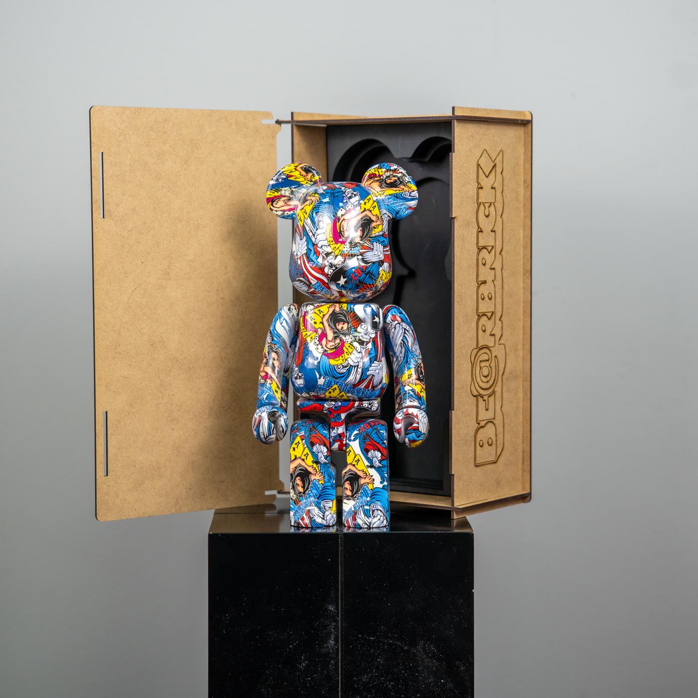
The practical lesson from Lichtenstein is to leave the pattern readable. A figure can still read as a block of color from across the room. Come closer, and the units of the print should separate.
A quiet wall behind it is enough. A second shouting pattern beside it turns the dot back into a blur.
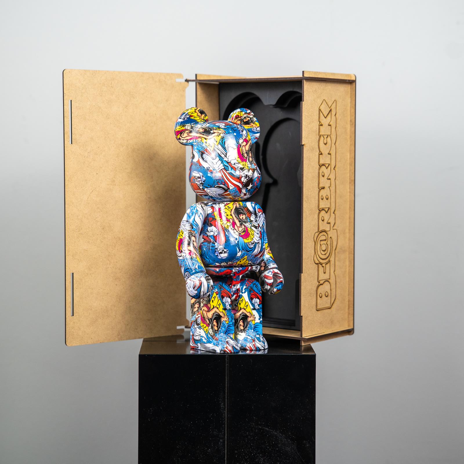
The comic-print bear carries that texture on a small body. It does not need to turn the room into a battle or a romance. The pattern itself recalls the energy of the source.
The leopard-print bear moves a repeated spot toward a fashion surface. They share a shelf only when the gap is generous.
If gloss throws a hard band of light across the print, a small turn of the figure brings the contour back. When you are choosing among decorative objects, decide first whether pattern or flat color will carry the room. They do not both have to be the main event. Lichtenstein’s lesson is to choose one order and let its scale be read.
A short closing
Lichtenstein enlarges the comic because the printed dot becomes a decision only at that distance. Look Mickey, Whaam!, and Drowning Girl are three feelings inside one decision. A shared language is not a shared subject.
Warhol is the other door, the door of repetition. The definition page keeps both names inside the term. The essay on color, scale, and repetition follows the pattern into the intervals a room can actually hold. On a shelf, one readable print is the cleanest answer to this history.