
What do color, scale, and repetition do together?
Color, scale, and repetition are how pop art changes the same image a little each time. Color changes as a commercial decision. Scale changes the distance between the image and your body.
Repetition shows that the change is a method, not an accident. Together they turn a copy into a series.
Warhol printing the same face, or the same can, in different colors is the clearest case. In Lichtenstein, scale lifts a small printed dot up to the distance of a painting. The frame of the term sits in what pop art is. This page holds the three tools side by side.
At home the trio speaks more quietly. Pink, purple, and red states of one form can make a series. The series reads as a series only when the gaps are close to one another. If the gaps scatter, you have three separate ornaments.
One image, a changing state
Repetition in pop art is less about finding a new subject than about choosing to vary a known one. A grocery label appears again. A face gains another layer of color.
Looking searches for the difference on the surface, not in the topic. That kind of attention is useful in a room as well.
A change of color can shift feeling without becoming a confession. Pink can sit lighter, purple heavier, red more direct. Those adjectives are not a fixed code. Cloth, daylight, and the neighbor on the shelf will show the same color differently.
The decision is not to memorize a code. It is to see all three in the actual place.
A restrained palette is the other end of that shift. One tone cuts the noise of repetition. A pop series multiplies tone on purpose. They do not contradict each other.
One is easier when the room is small. The other is easier when the wall is long. Two rooms in one home can hold both ends.
The gap is part of the repeat
Repetition is not objects touching. It is the empty space between them repeating too. If three figures stand in a row, the distance from the first to the second should sit close to the distance from the second to the third. One gap tight and one gap loose, and the eye sees a group that happened, not a series.
Height is an interval as well. One on a shelf, one on the floor, one on a cupboard, and the form may repeat while the scale falls apart. A shared horizontal line brings the row nearer to pop art’s grid.
The grid is not required. What is required is that the eye knows where the next piece will be.
Why scale matters tells the relation of a single piece to a room. Here scale is the proportion of the pieces to one another. If they share a form, that proportion is already close. The scale that remains is the length the group takes on the wall.
A short wall crowds a trio. A long wall lets it breathe.
One form, three colors
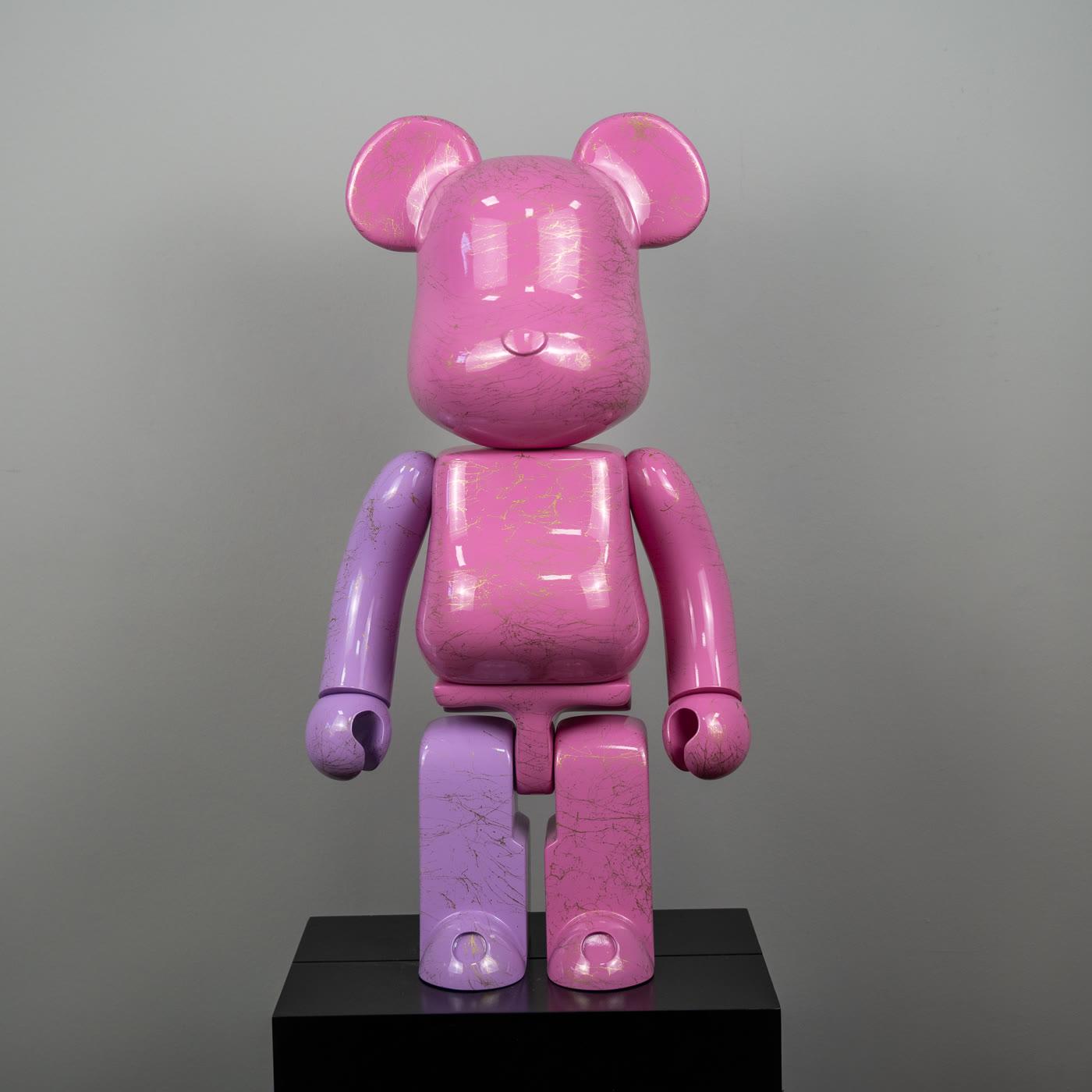
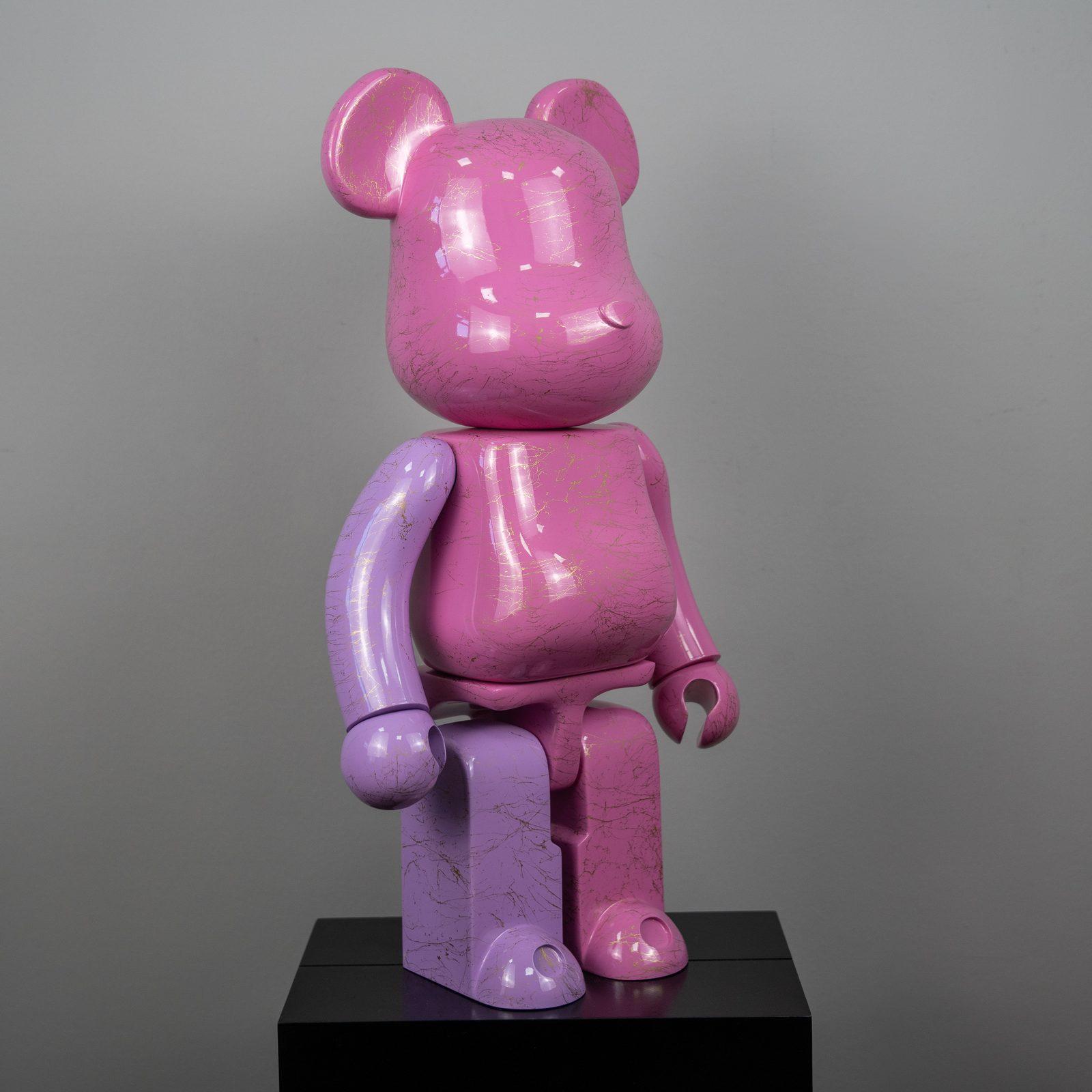
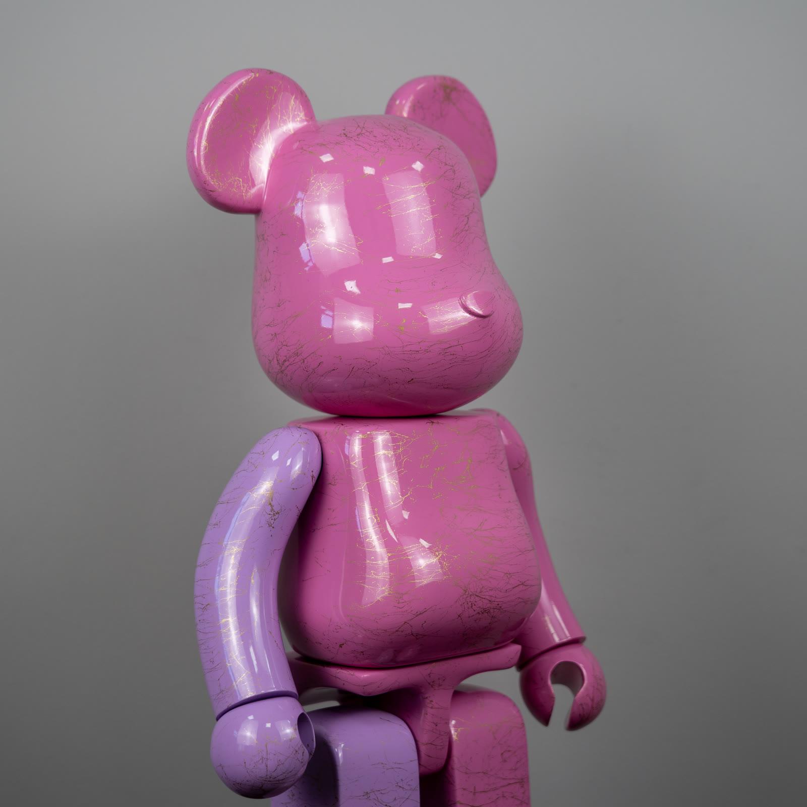
The pink figure with lavender limbs and gold marble pattern is the lightest voice in the row. Two tones put a small repeat inside a single color. The marble pattern does not have to fall in the same place on every piece.
That small difference is a distant cousin of the shift in Warhol’s prints. A cousin is not the same work.
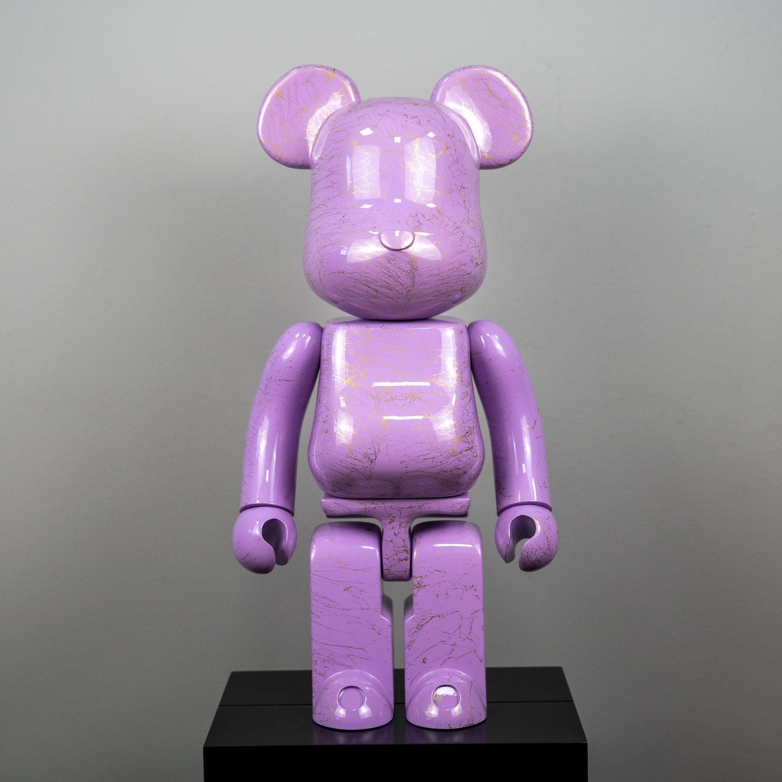
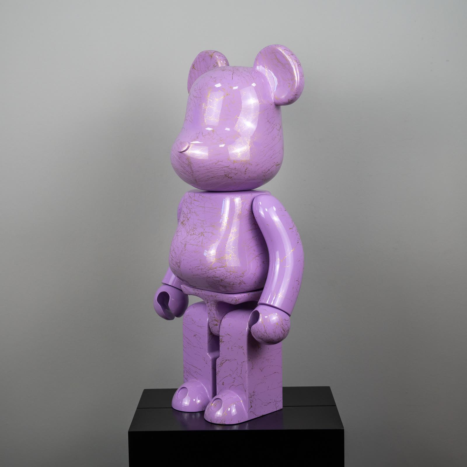
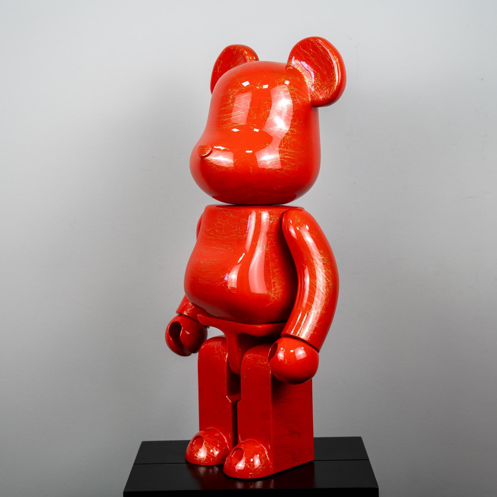
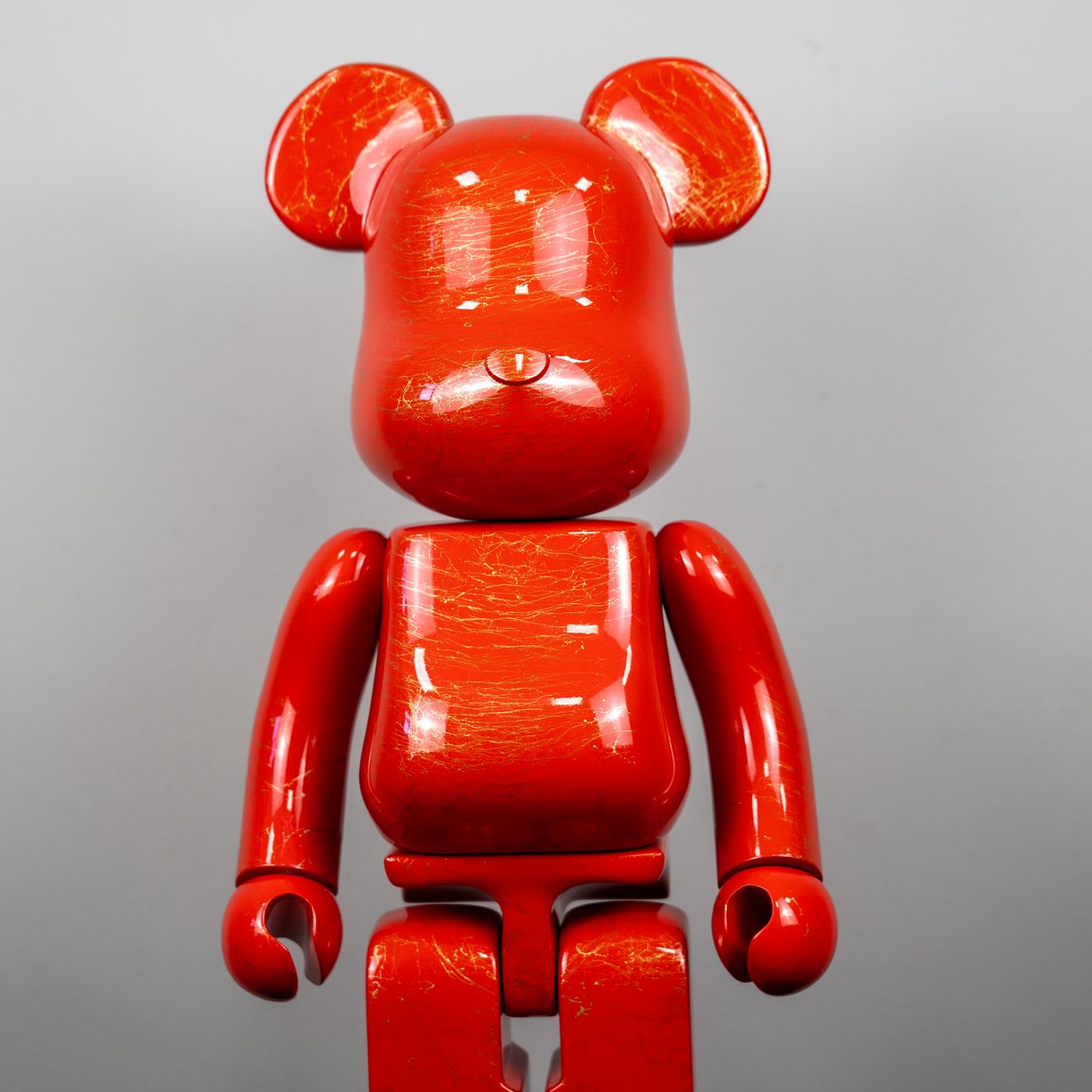
The purple figure with gold marble pattern holds the middle. Lavender gets heavier and reads fuller in evening light. The red figure with gold marble pattern is the most direct color in the row. Together they show one bear form changed by color.
The form stays. The state changes.
Taking all three is not a requirement. If the room carries one piece more clearly, one is enough. Two can set an end and a middle. Three become a series only with even gaps.
The selection is for comparing marble pattern and gloss. The decision follows the length of the wall.
Mix-ups about repetition
The first mix-up says repetition is clutter. Clutter is different forms piled on one shelf. Repetition is the same form standing side by side on purpose. Even gaps can look calm.
No gaps at all, and the row shouts. The fault is not in the repeat. It is in forgetting the interval.
The second mix-up equates more colors with more pop art. Three related colors make a series. Six unrelated colors make a display case. The third mix-up treats scale as physical size alone.
Three pieces of the same size build another scale when the gaps between them change. The gap is a measure too.
The fourth mix-up says every home should build the series. A single saturated piece is more honest in a small room. A series earns its place when there is a long console or an empty wall.
The method is a possibility, not a required set. Declining the possibility is also a decision.
How to build a group at home
Choose a lead color first. If the room is neutral, red can lead and pink and purple can accompany it. If the room is already warm, purple can lead and red can wait on another surface.
The lead can sit in the middle, or at the end where the eye arrives. At the end, the eye walks inward from there.
Then test the gap with the objects themselves. Set the three in a temporary row, leave even spaces, and wait a day. If daylight shows the marble pattern differently, change the order.
The lightest color does not have to stand nearest the window. If reflection washes it out, move it to the middle.
Do not grow the group by mixing characters. If the bear form is repeating because of color, a wholly different silhouette cuts the series. That silhouette can be another room’s work.
A restrained room is there if you want to return to one piece. The scale page is there to check whether the group has outgrown the wall.
A short closing
Color, scale, and repetition are three ways of changing one image. One is the decision, one is the distance, one shows that the decision is a method. At home the trio can become concrete in pink, purple, and red states of the same form.
It becomes concrete only with an even gap. Without the gap, repetition turns into a pile. The definition page holds the history.
The pages on restrained color and on scale leave the choice of not building a series as a legitimate one. One piece or three, if the interval is honest, the row is finished.