

Where does pop art meet decoration?
Pop art meets decoration where one graphic object, a deliberate gap, and a commercial color can be read against a quiet ground. The meeting does not require the whole house to become a period set. The historical language comes from ads and comics. The domestic version is narrower: a familiar silhouette, a flat color, a measured interval.
Decoration here is more than framing a picture. The height of a console, the color of a wall, and the angle of the light are already composition. Pop art can enter that composition as a decision rather than as a crowded theme. Pop art in daily rooms takes the decision into the living room.
Bulk is a separate question. Being seen from the door, taking floor, and meeting the ceiling belong to another page. Large art objects holds that scale. This page describes the meeting itself.
What a graphic object is
A graphic object reads as a sign from across the room. Detail arrives when you come closer. The silhouette arrives first. Faceted planes, the feeling of a heavy contour, or a single saturated color speeds that reading.
Pop art’s kinship with posters and comics lives here. The image is recognized before it is ornamented.
Matte black builds that recognition out of shadow. If the light shifts, the form stays by its edges. A glossy color gathers light and speaks from far away as a patch. Both are graphic.
One works through mass, the other through sheen. The room chooses which it can carry.
A character silhouette is a third route. People may know the form from culture before they know it as an animal or a face. That recognition shortens the story decoration would otherwise have to tell. The object can stand without a nameplate, provided the things around it are not shouting in the same voice.
The gap is also a material
Repetition in pop art looks like repetition only when the interval is real. Without it, you have a pile. Decoration follows the same rule. Two strong objects side by side weaken each other.
One of them going quiet lets the other finish a sentence. That quiet is not an under-furnished room. It is a measure you chose.
Wall color can be the quiet partner. Broken white, a warm gray, or a very pale beige will hold graphic black and a saturated color alike. Patterned wallpaper races the contour.
A race is not automatically a failure. In most homes it simply has no winner, and noise is what remains.
A gallery aesthetic builds the gap more strictly: fewer pieces, clearer light, eye level. Decoration can be a little looser. A book, a lamp, a tray from daily life can stay in the scene. The meeting with pop art holds when those daily things do not steal the event.
Two silhouettes, two voices
The matte black faceted gorilla, barrel overhead, builds a low-poly mass out of planes. From far off it reads as a sign. Up close it reads as sculpture.
Because the surface refuses shine, the edge gets ahead of color. In a lobby or a calm living room it carries graphic weight.
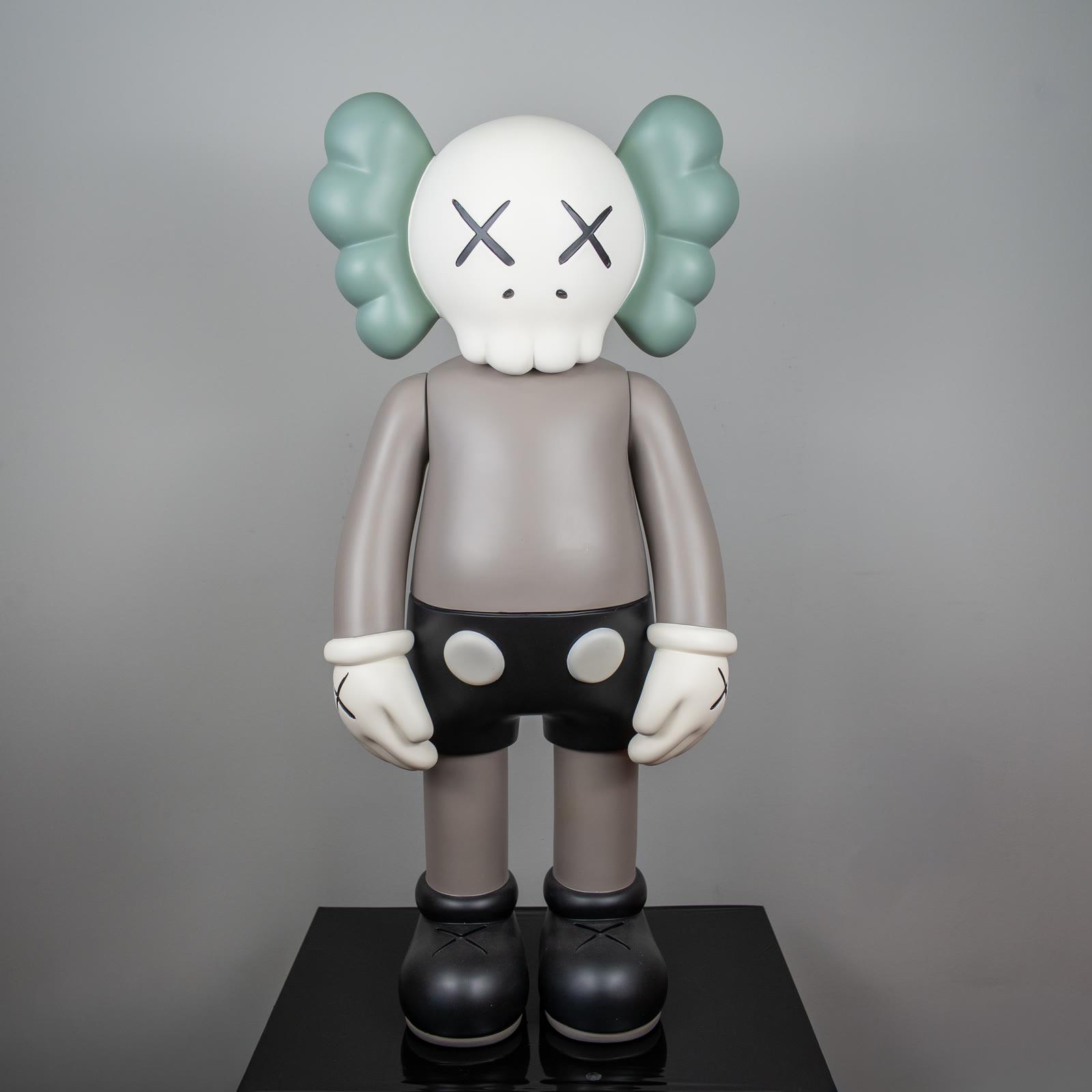
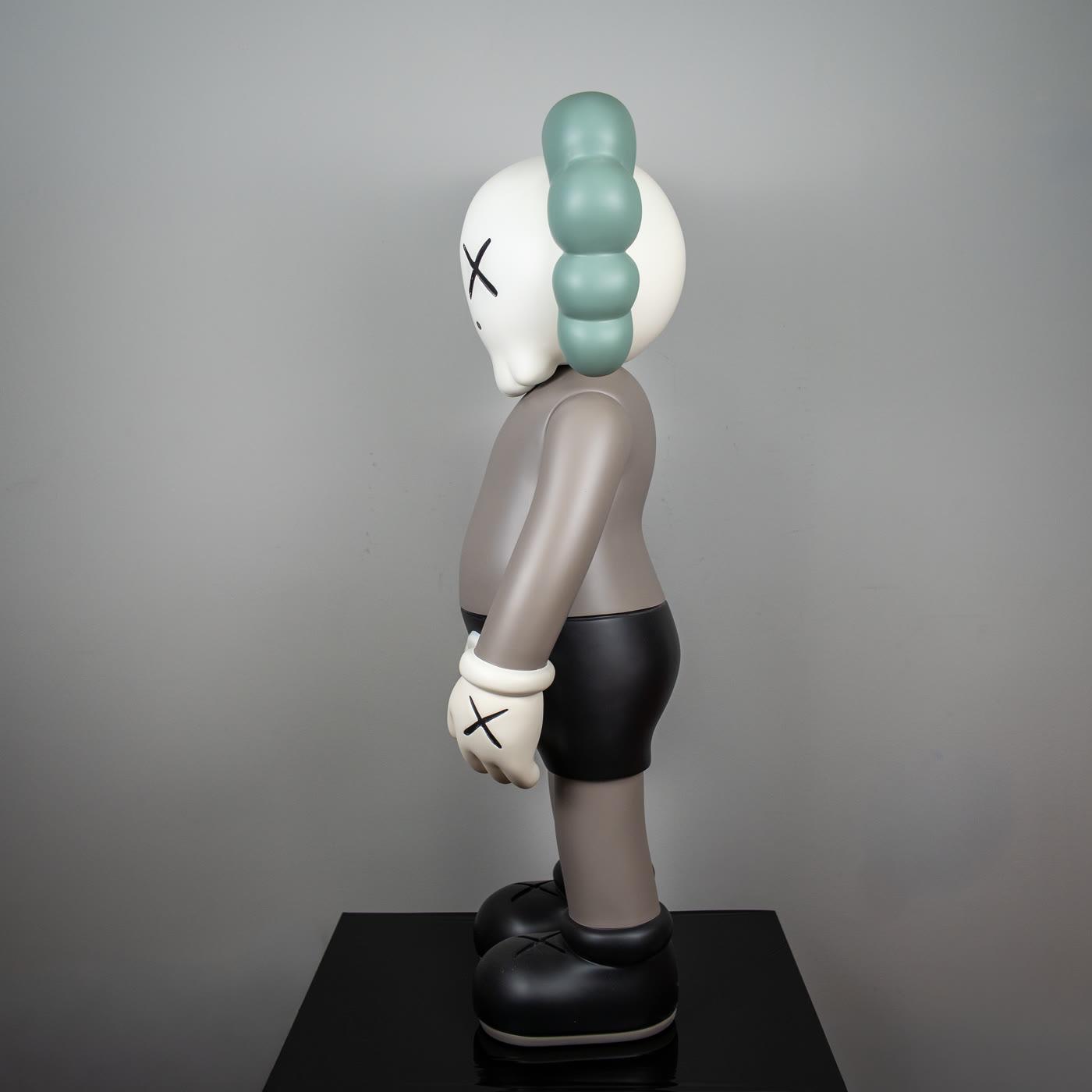
The Companion with sage ears asks for a lower voice. The character is familiar, the palette is narrow, the gesture is small. It belongs beside a large mass only when the room is genuinely wide. Alone on a short console, it holds pop art’s other lesson: a known image, a quiet ground.
They do not need to be forced into the same corner. One is a sentence about volume. The other is a sentence about silhouette.
The decorative selection is there to compare finish and stance. The choice depends on which voice the rest of the room can answer.
Mix-ups in decoration
The first mix-up paints every surface in primary colors and calls the result pop. Red, yellow, and blue do appear in this history. A room does not need all three at once.
One commercial color on a neutral ground speaks more clearly. Three shouting colors often slide into a nursery scheme, and the graphic decision disappears.
The second mix-up equates more signs with more pop art. Logos, posters, and figures stacked together stop being readable. Historical works can be crowded too. Hamilton’s collage is crowded, and it is arranged.
A pile at home is an unarranged collage. The third mix-up matches every object to one theme. Agreement does not require copying.
The fourth mix-up keeps art as background for the cushions. An object can be an accessory bought to race a pillow pattern. That use is ordinary. The meeting with pop art happens when the object remains visible as a decision.
When background and subject trade places, the meeting loosens. If both are shouting, there is no subject left.
A measured placement
Find the calmest wall first. If the first glance from the door lands there, a graphic object can stand alone on it. If it does not, choose the second surface where the eye actually stops.
The flank of a television is already busy in most homes. Adding a second movement there tires the form.
Then make one color kinship. A black frame beside a black sculpture is enough. The room does not need to be painted black.
Beside a sage figure, a nearby tone in a curtain or a book is enough. Kinship is not a uniform worn from head to toe.
Last, walk the interval. If your shoulder misses the object, the door swing misses it, and the lamp beside it does not cut the contour, the placement is done. Separate measures for large mass are in the essay on large objects. The principle stays: one graphic decision, and room around it.
A short closing
Pop art meets decoration in a readable object, not in a themed house. A graphic silhouette, a gap, and measured color are the three parts. When one is missing, the other two turn into noise.
The home essay is there for daily rooms, the gallery piece for a tighter presentation, the large-object piece when the volume grows. The selection is for seeing finishes side by side. The decision finishes in the quiet of the room, not on the shelf alone.