
What does a gallery aesthetic mean at home?
At home, a gallery aesthetic means a few objects read at eye level, on a quiet ground, with light from the side. The domestic version of a white cube does not empty the walls and stop daily life. It is an order in which the shadow of a form can be seen, and the things beside it agree to lower their voices.
Pop art enters that order as a graphic silhouette. A flat color, or a single gloss, disappears on a busy wall and clarifies on an empty shelf. Pop art in daily rooms allows a looser life around the object. A gallery aesthetic tightens that looseness by one step.
Light has its own account in the essay on lighting. Giving a whole room to the idea sits on the collection room page. The question here is whether one corner of a lived-in home can be thought of in a gallery way.
Fewer objects, a clearer stance
A gallery way of looking leaves the object alone. Tickets, small frames, and souvenirs split the glance once they gather beside it. Splitting can be the warmth of a home.
A gallery aesthetic chooses to postpone that warmth to another shelf. On the chosen shelf: one form, and a second if it earns the place.
Eye level is what makes the fewness work. Too high, and the form sticks to the ceiling. Too low, and it mixes with whatever is on the floor.
A console seen standing, or a low plinth, holds the right band in most apartments. If the same band is visible from the chair, the placement is finished.
The gap matters more once a second piece arrives. Two figures touching become one blot. A space wider than a hand and narrower than an arm is readable on many shelves.
The measure is not absolute. It is whether the eye can count them separately.
How light opens a form
A flat light from above turns gloss into a patch and matte into a faint shadow. Light from the side states the edge and opens the volume. A table lamp does this work in rooms that do not need a track.
The aim is not vitrine sparkle. It is knowing where the form ends.
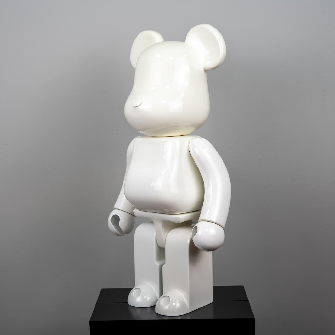
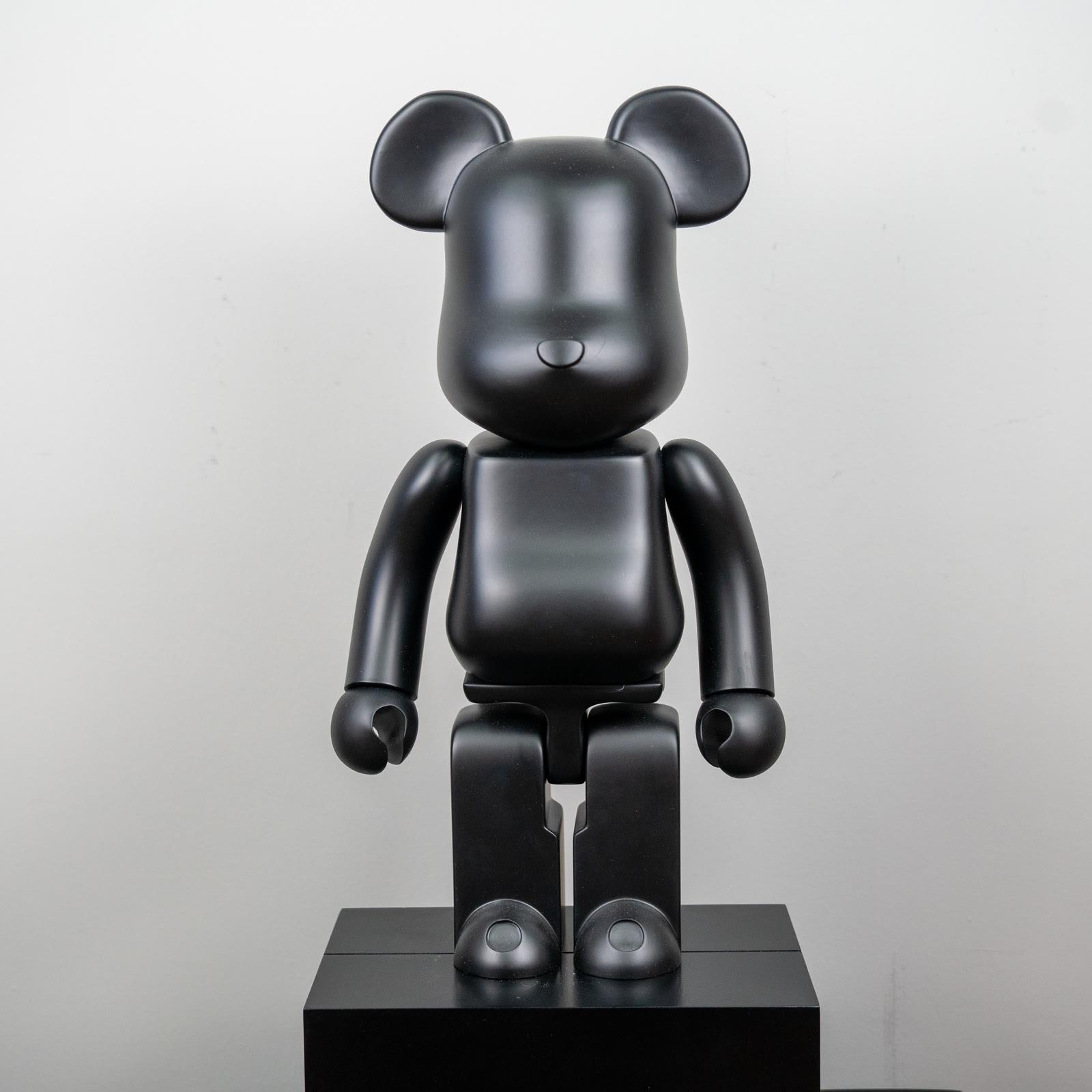
A glossy white body can disappear on a white wall. Side light produces the shadow that separates it. A matte black body already stands by its edge.
A hard spot forced onto it pushes matte toward shine. A softer side light leaves black black.
The daytime window is a source too. Setting the object square to the glass enlarges the reflection. A slight angle uses daylight as side light and still leaves room for the evening lamp.
The lighting essay keeps that angle more technical. At home, one evening of trying usually ends the decision.
White gloss, black matte
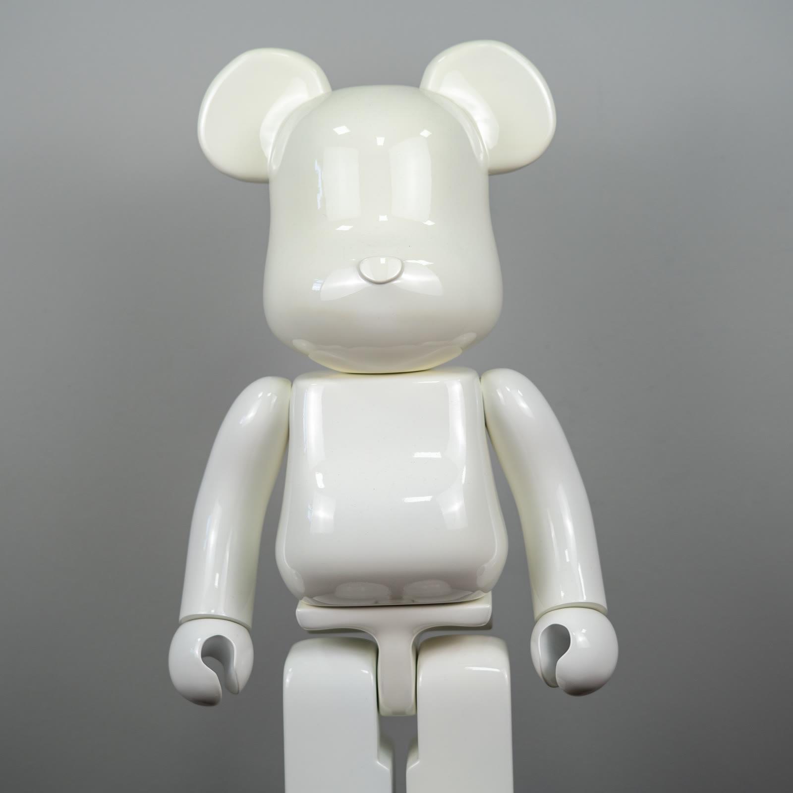
The glossy white bear stands like sculpture on a light ground, and if the ground is also light it needs a shadow. The reflection on its surface carries a small summary of the room’s window. The summary is pleasant until it swallows the form. When it swallows the form, the angle changes.
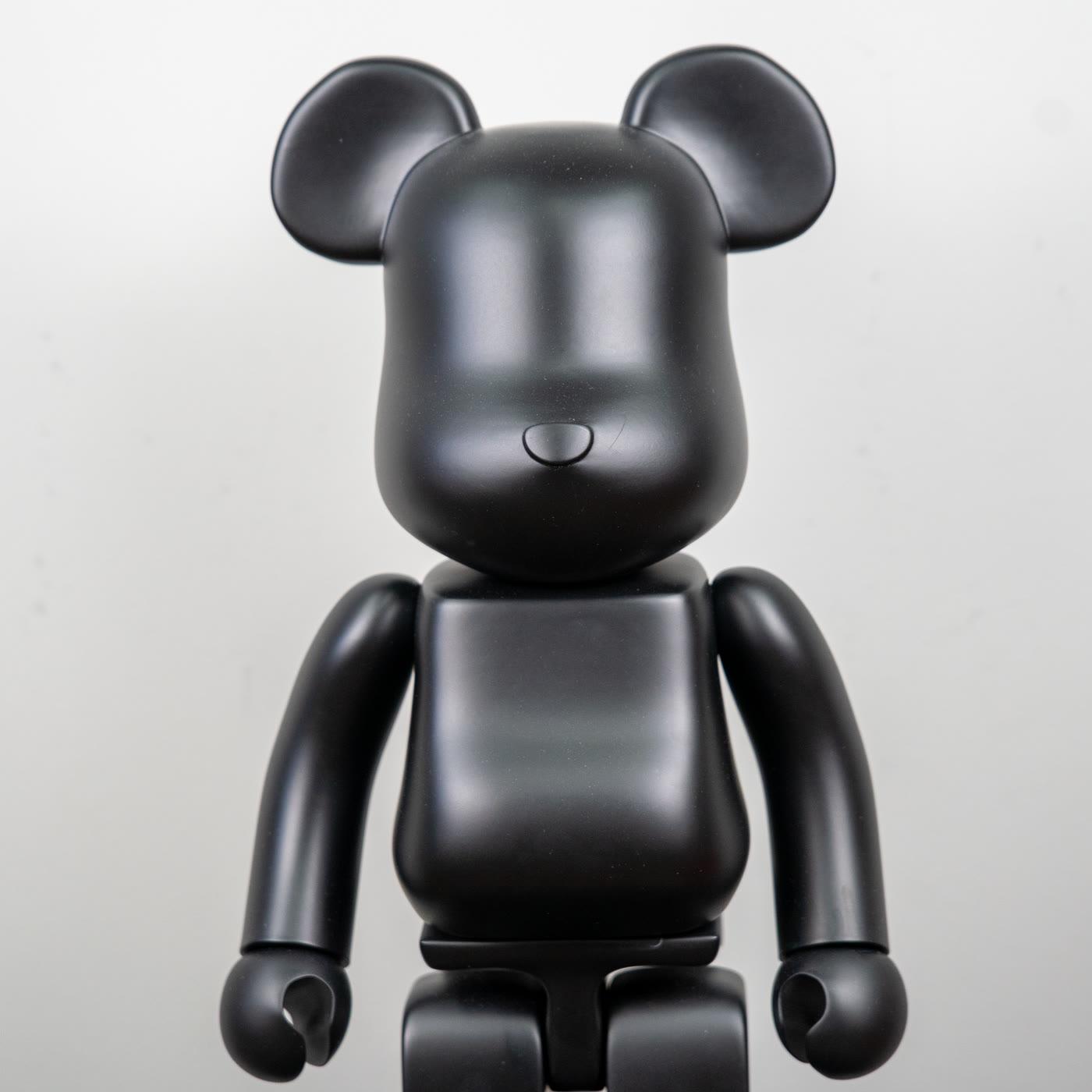
The matte black bear does not give the light back, so its silhouette is steadier. Beside the white one, the pair becomes a study in value: one reflecting, one absorbing. Pop art’s lesson about flat color appears here in a neutral state.
Color does not shout. Difference of value speaks.
Putting them on the same shelf means something when the gap is wide. When the gap is tight, black overwhelms white, or white turns black into a blot. The collections page is for a longer row.
A gallery corner can finish with two pieces. A third can be another wall’s work.
Mix-ups about a gallery look
The first mix-up says a gallery aesthetic is a cold, unlivable emptiness. Fewer objects do not mean an unlived house. One corner is built tightly. The rest of the room stays daily.
Sofa, rug, and lamp remain. What is tight is the surface immediately beside the object.
The second mix-up says the look cannot exist without track spots. One lamp from the side opens an edge. The third mix-up puts every object behind glass.
Glass multiplies reflection and turns the home into a case. A piece in the open, with dust kept in check, gives the gallery feeling more directly.
The fourth mix-up expects white always to vanish and black always to dominate. Ground, angle, and gap change both tendencies. The fifth mix-up spreads the aesthetic through the whole apartment.
One shelf is enough. Spreading it thins the decision.
Steps that fit on a shelf
Clear the shelf. Leave a single ground. A patterned cloth will race the form. Bring the white figure forward enough for a shadow to fall between it and the wall.
Set the black figure with a gap the eye can rest in. If they touch, pull one back.
Try the light from the side first, then from above. Keep the condition in which the edge separates. If the afternoon window is hard, a curtain half drawn can be cleaner than switching a lamp on. The collection room is there if you want to grow the experiment into a whole room.
Move small objects out of the same line of sight. Keys, a candle, a frame can live on another surface. Other essays on the journal divide the finer points of placement.
On this shelf the fine point is simple: two neutral figures, one side light, a gap you can count. That is the quiet end of pop art.
A short closing
A gallery aesthetic at home is fewer objects, side light, and a readable gap. Glossy white stands by its shadow. Matte black stands by its edge. They share a sentence only when the interval is real.
Daily rooms are described on a looser page. Lighting and the collection room stay open if you want to enlarge the corner. The corner itself can remain small.
Remaining small is not a weak decision. It is a clear one.