
How does pop art sit at home?
At home, pop art sits as an object you can read in one glance from the sofa or the door. A glossy color gathers that glance. If the surfaces beside it stay quiet, the object has found its place.
The apartment does not need to become an exhibition. The image only needs to stay chosen while ordinary life continues.
This is the historical picture come down to domestic scale. The flat color of advertising and a familiar silhouette do useful work on a console or in a corner. Where pop art meets decoration keeps the principle wider. This page comes into the room where people actually sit.
A living room asks for separate attention, because the television, the window, and the path through the room are all present at once. A figure in the living room finds a way through that crowd. The question here is more general: can a home carry this language without tiring it?
The sightline comes first
People at home do not always stop in front of art. They pass it while making tea, taking off shoes, looking at a phone. Pop art suits that short look, because its images were built to be known from a distance. Place follows where the short look actually lands.
A console visible from the threshold is, in many apartments, the cleanest line. The surface just behind a sofa back is lost to the person sitting and is a surprise to the person entering. Choose one. Filling both splits the home into two display cases.
A path used by children and guests does not want a fragile placement. A glossy figure set at the lip of a drawer is at risk every time the drawer opens. Moving it a hand’s width inward keeps the view and eases the use. Courtesy and placement are on the same line here.
Gloss, color, and daylight
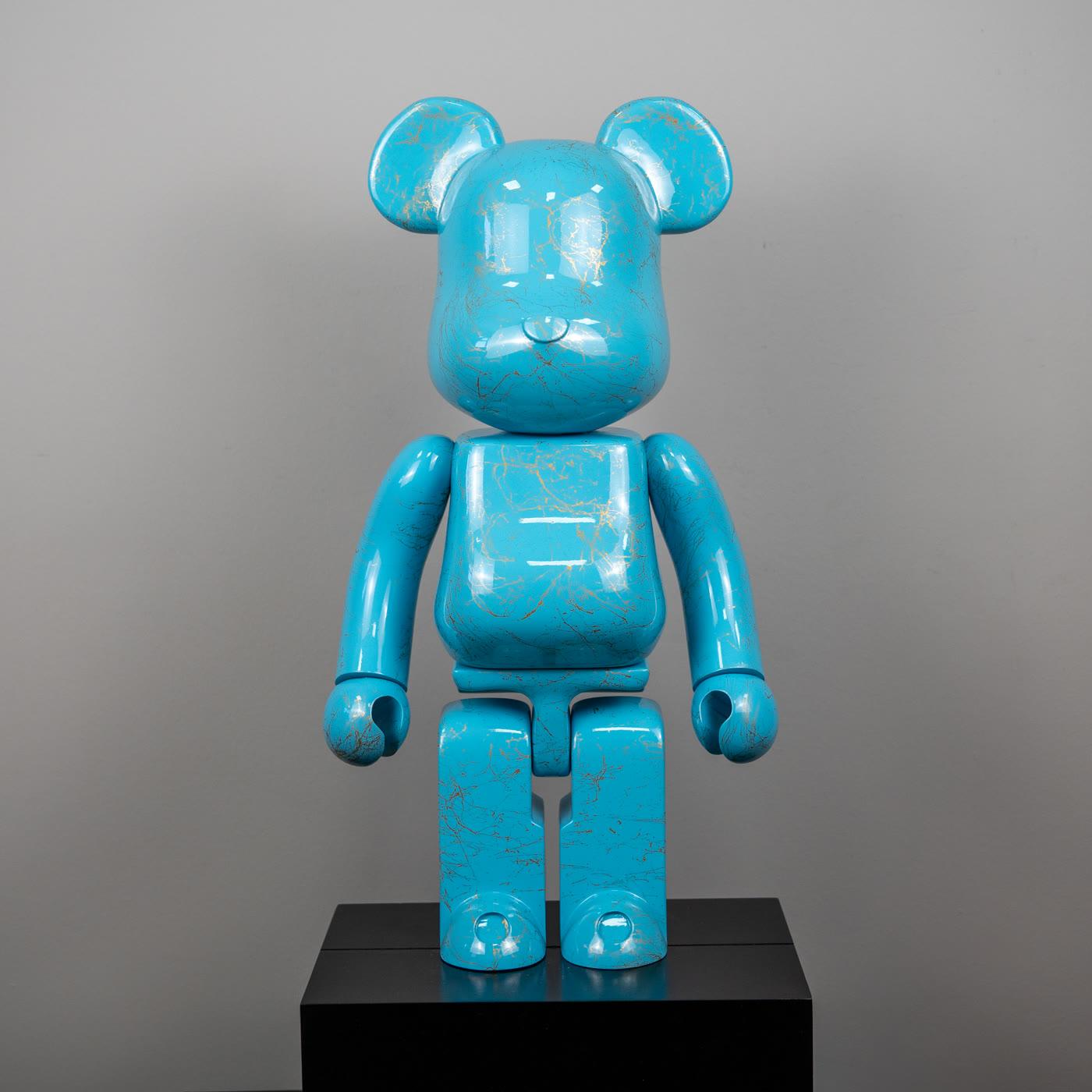
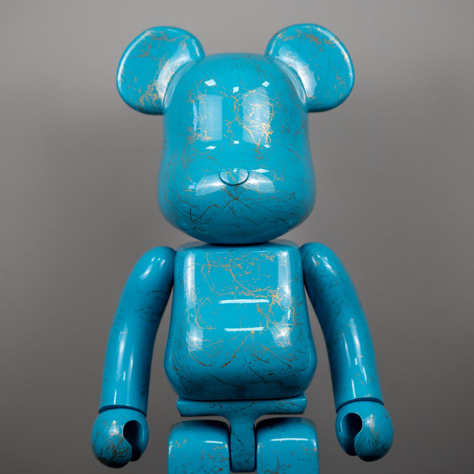
A commercial color such as turquoise separates itself at once among neutral cloth. A gold marble pattern breaks the color the way marble does, not the way jewelry does. On a glossy surface, window light travels.
That travel can erase the form or wake it. The difference is whether the bright patch sits at eye level or down at the shoulder.
A hard west window in the afternoon opens a wide mirror on a glossy body. Setting the figure on a slight diagonal, rather than square to the glass, narrows the reflection. A thin curtain may repeat the color faintly on the wall.
That repeat is a pleasant kinship. If the curtain copies the same turquoise exactly, kinship becomes costume.
At night, the warm light of a table lamp shows the same surface more softly. One lamp gives more volume than a flat wash from the ceiling. A gallery aesthetic builds that light with more discipline. At home, one lamp is often enough.
A quieter second object
A glossy color can do the room’s whole job alone. If a second object joins it, the second voice should be lower. A narrow palette, a matte surface, or a small gesture fits. Two glossy colors side by side mean the home is displaying both instead of choosing.
The turquoise bear with gold marble pattern brings a vitrine color into the house. In daylight the marble patterns read as fine lines. The Companion with sage ears, set beside it, does not widen the palette.
It steadies it. Sage is a relative of turquoise, not a rival shout.
A book or a small stone is enough interval between them. The gap can be a hand or an arm. The measure is that a third colorful object has no place left.
The collections page is for people thinking about more pieces together. In one room, fewer decisions last longer.
Mix-ups about the home
The first mix-up says pop art at home requires 1960s furniture. The language is flat color and a familiar image. The year of an armchair does not have to carry it. A plain sofa is a cleaner ground for a graphic object.
Period decoration is its own curiosity. It is not a condition of this placement.
The second mix-up says these objects cannot live in a house with children. They can, off the path and on a surface that will not tip. The third mix-up assigns every room a theme.
One turquoise figure is not a reason to paint the whole apartment turquoise. Kitchen, bedroom, and hall do not have to repeat the same sentence.
The fourth mix-up expects gloss to look beautiful in every light. At some hours the surface is only the window’s reflection. That is not a fault in the color.
It is a failure to think about place and hour together. Seeing the object once by evening lamp and once at noon makes the choice honest.
Choose for the way the room is used
Decide first which hour the object will be seen. A short morning glance only needs a silhouette that reads from far away. A long evening in the chair makes the marble pattern and the edge matter up close. The two needs may not want the same spot.
Then count the neighbors: remote, frame, plant, cable. The pop object should not race that list. Removing one neighbor does more than buying a new piece.
The living-room figure ties this clearing to how people sit. The same principle works in a hall: the shoe bench and the sculpture should not share one glance.
Last, try the second object. If sage belongs beside turquoise, leave it. If it does not, take the second piece to another room. A home does not have to be a vitrine.
While you move through the products, keep one real room in mind. The light you live with is a truer measure than catalog light.
A short closing
At home, pop art holds as a sightline, one glossy color, and, if needed, a quieter second object. The daily path, the window, and the neighbors on the shelf either carry those three or scatter them.
The wider principle is in the decoration essay. A tighter presentation is in the gallery piece. The living room’s own crowd has a separate page.
A home does not have to perform all of them at once. One line of sight, one color, is enough.