
What a figure is doing in the living room
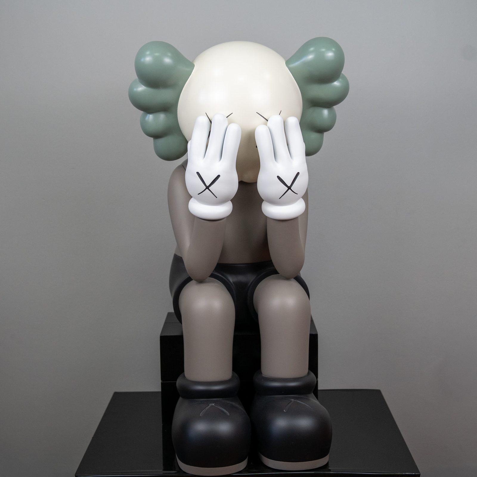
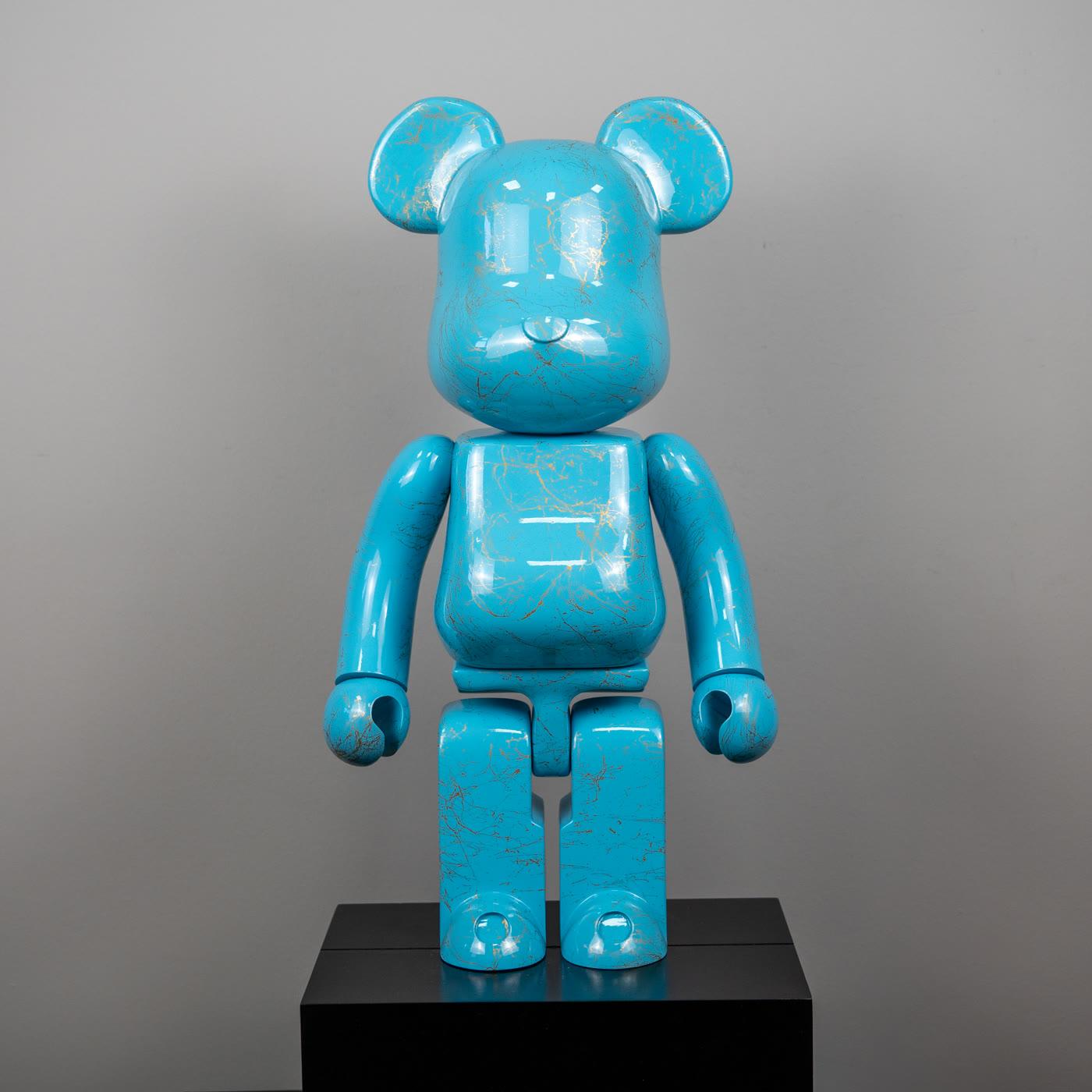
A figure belongs in the living room when it agrees with the sofa line, the first view from the door, and the light you actually live with. It does not belong there merely because it is the largest object you can carry in. A seated taupe piece with its hands on its face can hold the room quietly. A single glossy color, turquoise with a gold marble pattern, works in that same room only as an accent. Parking a sculpture opposite the television does not turn the apartment into a gallery.
The right spot is one you can still read from the threshold, and one that sits near shoulder height when you are on the sofa. The decision comes from those three relationships, not from the excitement of a product photo. The figure does not replace conversation. It gives the room one more reason to be looked at. If the seats face each other, keep the piece outside that triangle, on the edge where the eye rests. If the seats face a screen, do not bury the figure inside the screen wall. A clear stretch of wall beside it, or the end of a low console, is the more honest place. The aim is simple: a guest distinguishes one silhouette, then sits down and is allowed to forget it.
The view from the door and the way you sit
The first look comes from the door. Stand on the threshold and scan. Where does the eye land, and where does it stumble? A figure reads when it stands alone on that path. If a lamp, a vase, and a pile of cushions already occupy the same line, the figure disappears into the crowd. Empty surface around an object is part of the material of a living room. Leave a calm margin beside the piece, about the visual width of an armchair. That is a breathing space, not a measuring rule.
Seat height is the second decision. A sculpture dropped in the middle of a low coffee table is squeezed between knees and cups. A console, a hearth ledge, the closed end of a sideboard, or an empty niche are better candidates, as long as the head of the piece is not lost in cushions when you sit. Do not put it in the walking line. A living room is also a corridor. A piece that is bumped, constantly turned, or tangled in cables is an obstacle.
Taupe as the anchor, one color as the accent
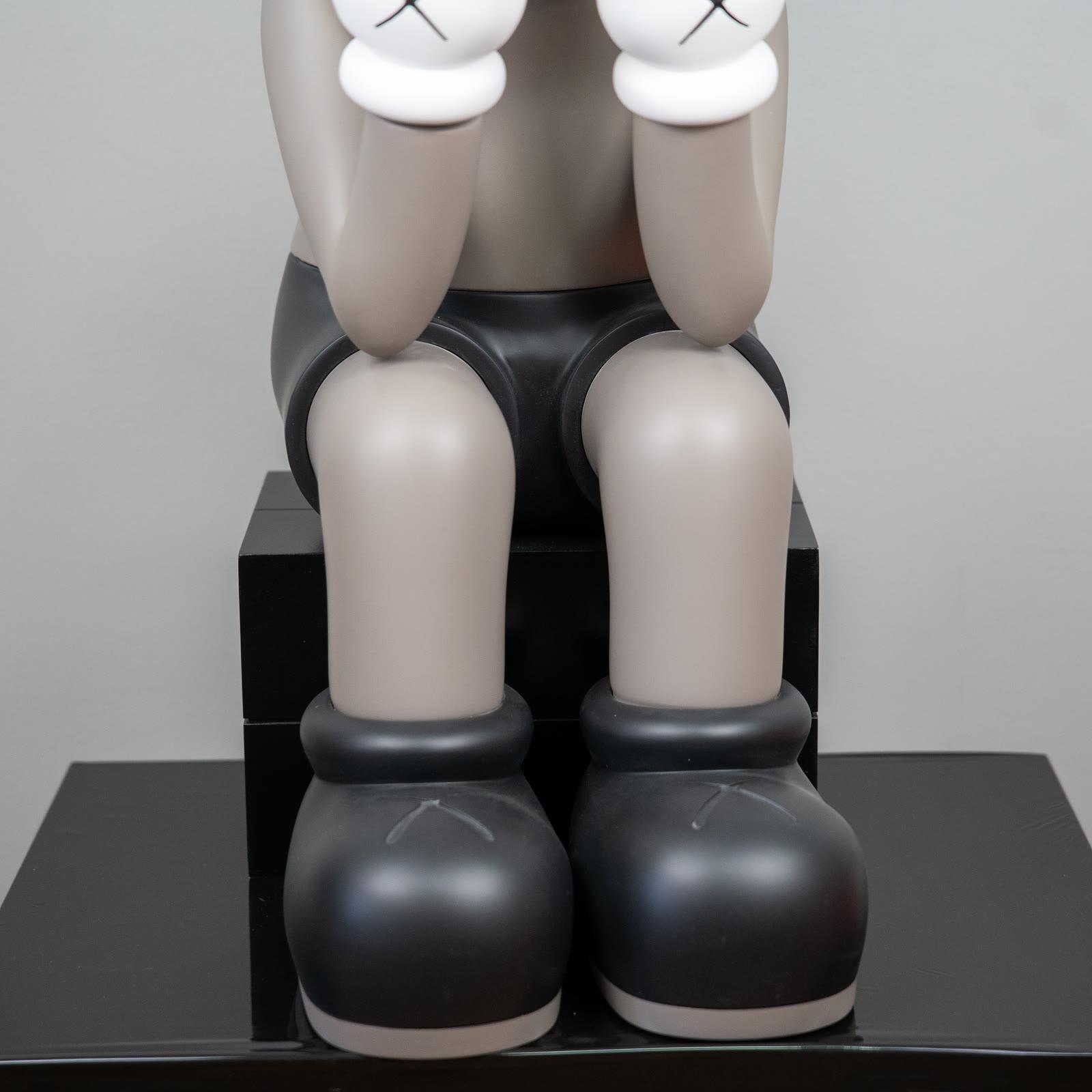
Passing Through in taupe sits with its hands over its face. The matte body does not throw light back, and the black shorts and boots pull the silhouette down to the surface. In a living room of pale walls, linen, and wood, it can be the focus without raising its voice. The pose is already a pause. Putting it in the exact center of a busy media unit makes that pause compete with noise. It reads more clearly on a side wall, where the seating looks but the screen does not own the view.
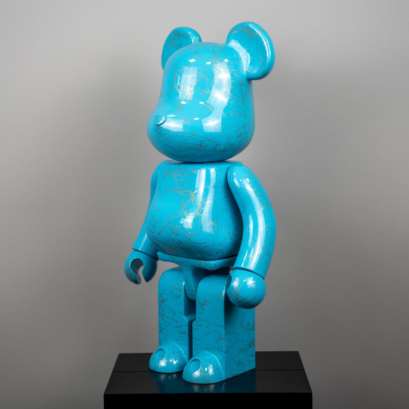
The turquoise marble bear says something else. Glossy turquoise and a gold marble pattern want to be the only color event in the room. In a neutral living room it works as an accent when it stands alone on a quieter surface, not in the middle of the coffee table. Stacking the seated taupe figure and this glossy color in the same corner collapses two stories into one. Let one be the focus and keep the other for another room, or another season. Walking the KAWS selection and the collection gets easier if you keep asking the same question: is this piece holding the room, or placing a single point of color in it?
Scale, ceiling, and viewing distance
Scale is not a centimetre printed on a box. It is the figure’s relationship to the sofa back, the ceiling, and the distance from which you first see it. In a low-ceilinged room, a placement that leaves air above the head is kinder than pushing the piece toward the ceiling. In a tall room the same piece can shrink at the foot of a huge empty wall. Try a plinth, or a closer viewpoint, before you assume you need a different sculpture. A plinth should join the furniture family. It should not look like a leftover carton.
Judge it against the sofa arm. Far below that height, and far away, it reads as a table object. Near eye level, it reads as sculpture. Both are legitimate. Do not confuse them. A seated pose is already a low mass. Leave it on the floor, deep in the room, and it may vanish from the door. A standing guest and a person on the sofa do not share an eye line. Choose one of those looks and place for it. Choosing a single focus piece carries the same question into the rest of the home.
Daylight and the evening lamp
Living-room light is domestic light, not a museum spot. If the afternoon sun heats one chair, do not make that patch the figure’s permanent home. Matte taupe stays calm in daylight. Glossy turquoise brings the window into the room like a mirror. At night, a glossy surface directly under a ceiling light shows you the bulb. Light from the side, soft and a little high, describes the form. A hard beam from the floor turns the face and the hands into a mask. Skip that unless a theatrical read is truly what you want.
A curtain is enough for part of the day, not for the whole afternoon if the sun still sits on the piece. Glass itself is not a guarantee. Move the figure back from the window reveal, onto a surface the moving patch of sun does not cross. In the evening, one lamp is a better companion than every ceiling fitting at once. On a glossy marble-patterned surface, let the reflection come from a shaded, broad source. A bare spot shows its own filament, not the marble pattern.
Mistakes that keep coming back
The first mistake is believing bigger is always righter. A large mass that has no relationship to the sofa makes the room feel smaller and turns the seating into scenery. The second is thinking the figure must match the upholstery exactly. Neighboring tones are enough. Taupe can be kin to beige linen without sharing a paint code. The third is filling every gap. A living-room figure does not deserve the whole shelf. A piece lost among books, candles, and remote controls is clutter.
The fourth mistake is the top of the television, where heat and dust collect. The fifth is treating a photographed hotel lobby as the plan of your own room. Those pictures are not an installation promise. Your door, your window, and the depth of your sofa are a different room. Using a KAWS figure at home and decoration with Bearbrick open that difference piece by piece. Neither is a ready-made room recipe. Both are a way to decide.
A short check before you commit
Take the piece out, set it on the surface you have in mind, and look at it once in the evening and once in the morning. Enter from the door, sit, then stand. In all three views the figure is either readable or hidden behind something. If it is hidden, move it. Do not reach first for a different size. The surface should be stable, level, and wide enough that a small bump does not send it over. The line a child or a pet can reach, the corner of a glass table, and the top of a radiator are not candidates.
Dust weekly, dry, with something soft. A piece that lives in the room is less sheltered than one in a case, and it is not cleaned with bathroom chemicals. Oily hands mark matte and gloss alike. If you are still looking at that corner a week later, the placement has held. If you are not, the piece is in the wrong room or it has too much company. Take something away. A short note is enough to ask which piece is actually in hand. Describe the surface and the light you have. You do not need to measure the apartment together.
Walk the room once more
The living room is not the storage room of the collection. A seated taupe figure can hold it. A glossy turquoise figure can put one color into it. Forcing both onto the same sightline spoils the job of each. If the piece you chose is visible from the door, is not fighting the sofa, and does not live in the afternoon sun patch, the placement is done.
Come in through the same door the next day. If the first look still finds that silhouette, scale, color, and place are agreeing. If it does not, you need calmer neighbors, not a new sculpture. When the collection grows, the task is not to carry every new piece into the living room. It is to decide which one is this room’s sentence.