
What a figure adds to a room
A KAWS figure places a familiar body in a room and keeps that body from shouting. The Companion's rounded, skull-like head, X-shaped eyes, gloved hands, shorts, and boots read from across the space. Legibility is the real contribution to decoration. The wall does not merely gain one more colour. The room is measured by a character's stance. A standing figure offers a greeting. A figure in the Passing Through pose slows the room while the hands cover the face. The name of the pose is not a quotation. It describes the posture. The interior decision begins exactly there. Does the room want a greeting, or a silence?
That contribution does not require turning the whole wall into a themed set. One figure, on a plain ground, with a little air around it, does the work. A figure in the living room is a wider question of placement. With KAWS, the calm comes from the character's own grammar. The face is already simplified. If the room joins that simplification, the figure relaxes. A crowded gallery wall makes the X compete like a sticker. An empty surface shows it as sculpture again. Decoration here is not adding. It is making room.
A glossy red surface
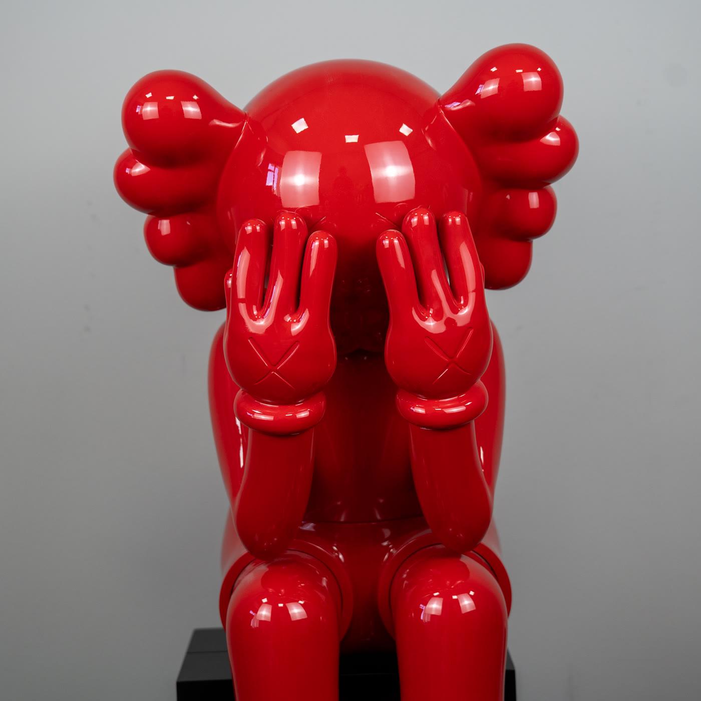
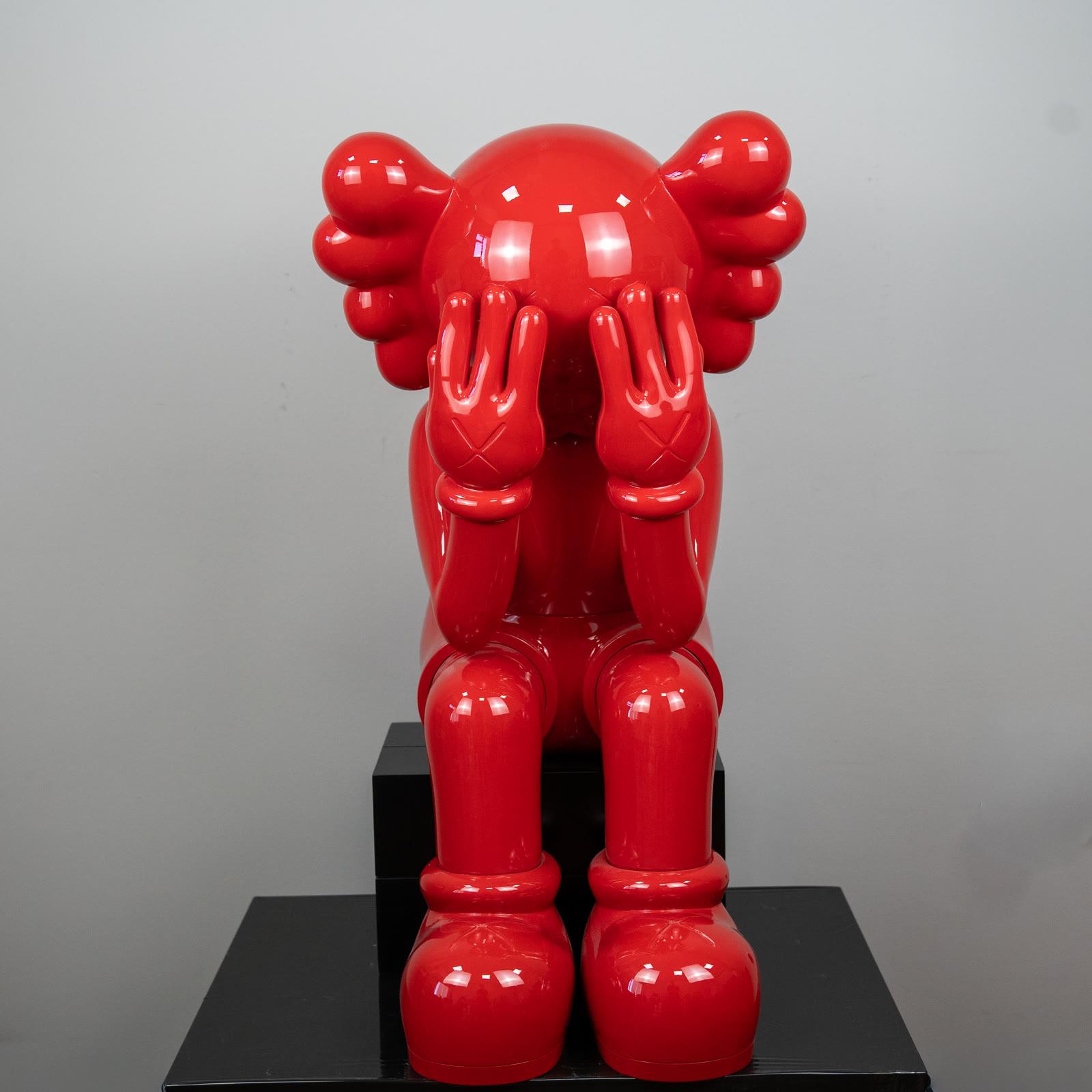
Glossy red is one of the clearest colour decisions a room can make. It mirrors light and carries the window and the lamp onto the figure. A red Passing Through therefore asks for a different room from a matte figure. Wedging the surface into a dim corner smothers the gloss. Throwing it into a feast of competing colour makes the red ordinary. The right place is a point where the figure can take light and still remain alone. Because the hands cover the face, the colour does not step in front of the gesture. It builds a halo around it.
Red is a shouting colour of popular culture, and here the shout can be held. On a light, plain ground, red stands like a jewel. When the ground leans red as well, the figure dissolves. A black or warm-grey cabinet carries the gloss without fighting it. Being a statement piece is not filling every corner. It is being the clearest sentence in the room. Glossy red can build that sentence, provided a second sentence is not shouting at the same height. A vase, a lamp, a poster: if all three line up on the same plane, the figure stops being the focus.
A standing Companion and a seated pose
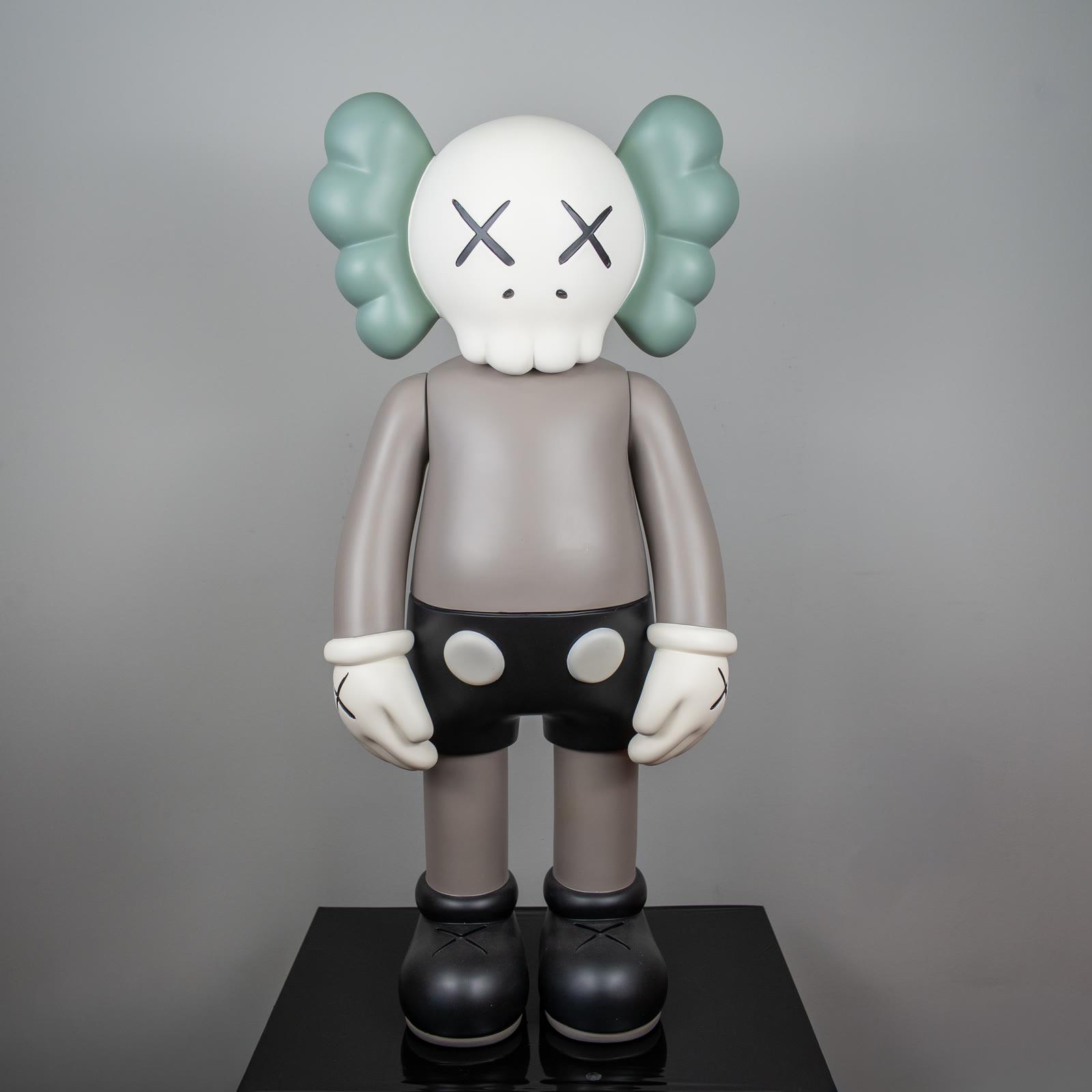
A standing Companion is a natural guest for a hall and an entrance. The face is open, the stance is upright, and the eye line sits near a person's greeting. In a living room, the seated pose joins the tempo of a sofa more easily. In Passing Through the hands cover the face. The figure does not enter the conversation. It stays beside it. That distinction does not force you to take both pieces. The room's existing voice chooses. A talkative salon can carry a silent pose. A quiet work corner may need the open face of the standing figure.
If you place the two together, keep the palette close. A sage and taupe standing figure and a glossy red seat do not fight only when air remains between them. Setting them flush builds a shop window. Taking one to a console and the other to a lower table keeps two times in the same room. One is a greeting. The other is a pause. The aesthetic indoors continues this relation through colour and air. What is practical here is which pose belongs to the door, and which belongs to the seating.
Colour, ground, and air
The ground is the figure's second colour. A light wall separates sage ears from a taupe body. A dark wall can swallow matte black, and it sharpens glossy red. Wood speaks well with a warm taupe. Glass and metal multiply a glossy surface. If you like that multiplication, it is a gift. If you want a plain silhouette, it is noise. When a carpet pattern runs all the way to the figure's feet, the weight of the boot disappears. A plain plinth, a niche, or a simple tray keeps the character's grammar.
Air can be built without stating the measure in centimetres. If a comfortable breath, about the figure's own width, is visible around it, the place is right. If a neighbour touches a lampshade or a frame, the place is tight. Height is chosen with the same calm. A standing figure is at ease at a level where the eye finds the face without strain. A seated figure sits closer to a seated person's gaze. A table or a low console meets it. Lifting it to the ceiling shrinks the pose. Sticking it to the floor turns it into a toy. The interval is between the two.
Placement mistakes that recur
The first mistake is to wedge the figure in front of a poster wall. The character is already a visual language. Racing a second language of posters turns the X into a sticker. The second is to fill the whole shelf with one theme. A Companion loses its grammar among ten small objects. The third is to put glossy red directly under the sun. The surface both mirrors the room too hard and tires in prolonged direct light. The fourth is to treat the seated pose as a flaw in the standing figure. The piece is not incomplete because the hands cover the face. The pose is that closure.
A fifth mistake belongs to us, and it should be said. Counting a catalogue figure as KAWS's original sculpture or as a licensed edition. The pieces at Popüler Sanat are finished collection objects that carry this silhouette and this pose. In decoration, that honesty is a relief. The piece serves the room without claiming to be a museum copy. You then place it more calmly than a trophy, and more honestly than an imitation of a monument. The list of mistakes is long. The right place is usually shorter: a plain ground, enough air, the right pose.
Living room, hall, and table
In the living room the figure stands where the gaze rests, not in the direction the seating already stares. Immediately beside a television, it races the screen. A niche, the end of a console, or a tray brought in from a windowsill and kept out of constant sun works better. In a hall, a standing Companion meets an arrival more calmly than a poster. Because the face is open, it speaks to the door. On a desk, scale should not lose to clutter. When paper, cable, and a cup lean against its feet, the character becomes an accessory. If the desk is calm, it can remain a small focus.
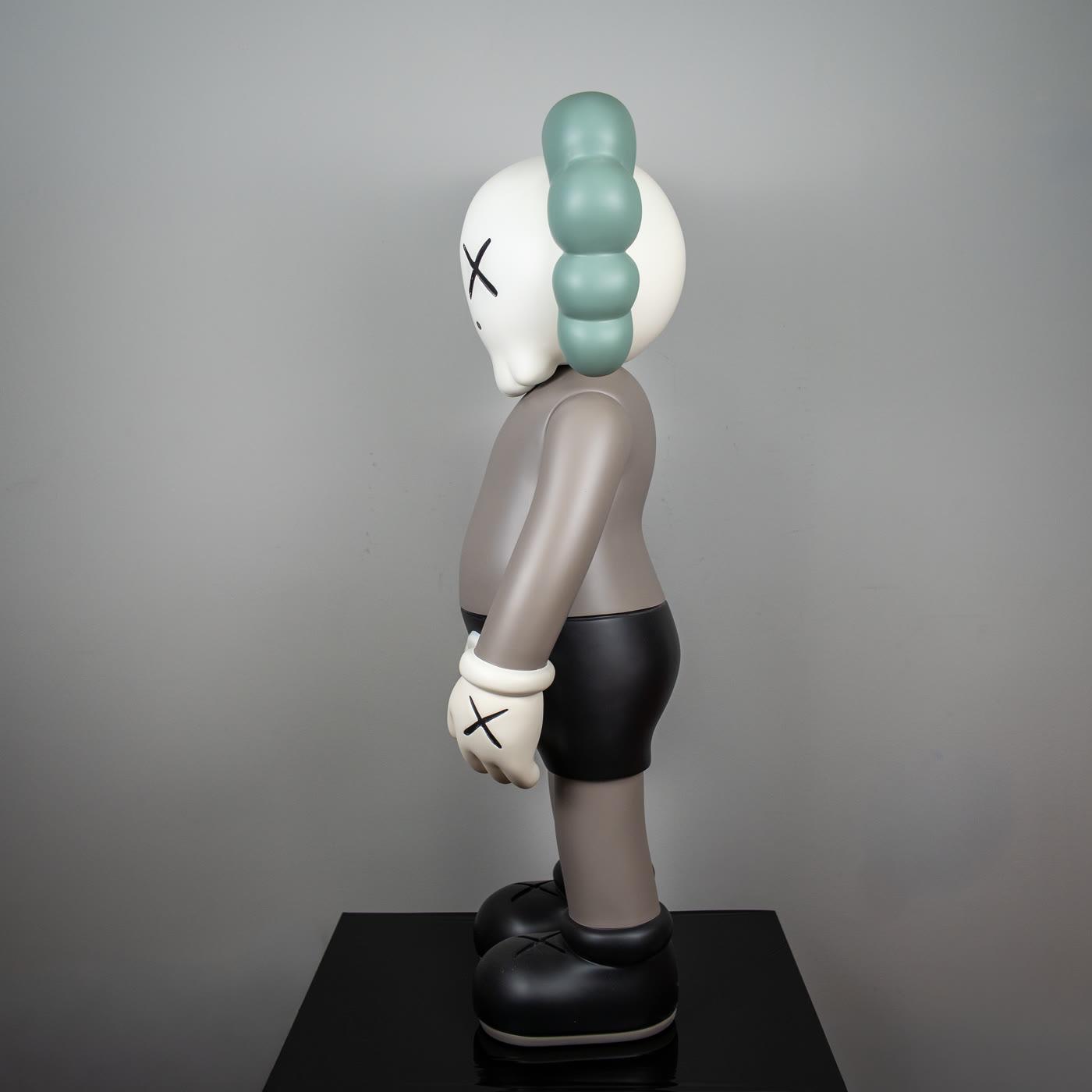
The glossy red Passing Through is close to being the living room's one clear sentence. It sits, the hands cover the face, and the surface carries light. Leaving it alone lets the red do its work. The Sage Companion is lower-voiced for a hall or a quiet console: sage ears, a taupe body, black shorts, white gloves marked with X, and black boots. The two do not have to share one shelf. Among decorative objects, the choice follows which sentence the room needs. Red wants a focus. Sage wants company that stays quiet.
Choosing the piece
The choice is made first by pose. If the room receives guests, the standing face is a more open door. If the room is already full and talkative, a seat with hands on the face gives the room a pause. Colour comes next. Glossy red is brave and wants air. Sage and taupe speak easily with wood and linen. Light is looked at last. A matte surface deepens under soft light. A glossy surface writes the window opposite onto the figure. If that window faces a busy street, the red figure carries the street as well. Whether you want that is clear before you take the piece.
The catalogue sits on the KAWS page. We do not invent measurements. Picturing the figure in your room, and imagining a breath around it, is more useful than any sentence in centimetres. The rest of the interior essay is how the aesthetic affects a room. This page is more practical: a greeting, a silence, a red, a sage. All four carry the Companion's language. All four do not belong to every room. Choosing the one that belongs is decoration in its calm form.