

Why was the bear form treated as a canvas?
The bear form was treated as a canvas because the silhouette could carry an image without becoming unrecognizable. The BE@RBRICK that Medicom Toy introduced in 2001 is built from a cylindrical torso, round ears, a simple face, and articulated block limbs. That scarcity, associated with the designer Tatsuhiko Akashi, left a level field for graphics. A new character did not have to be invented. An image that already existed could ride a familiar body.
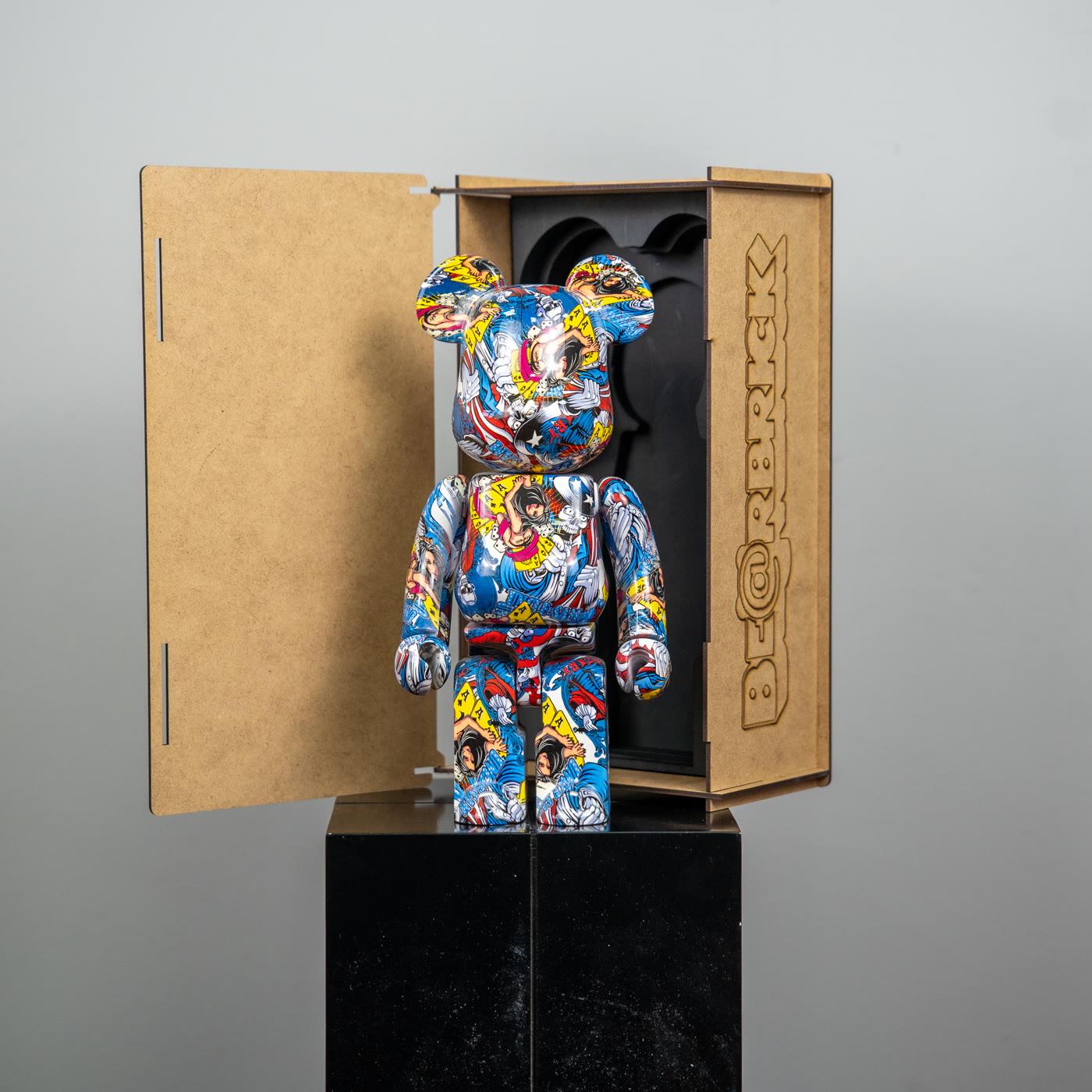
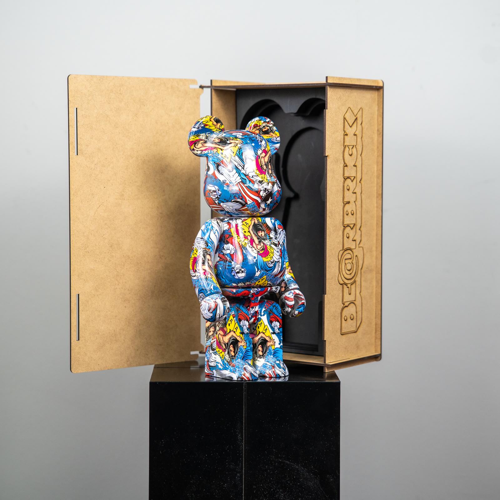
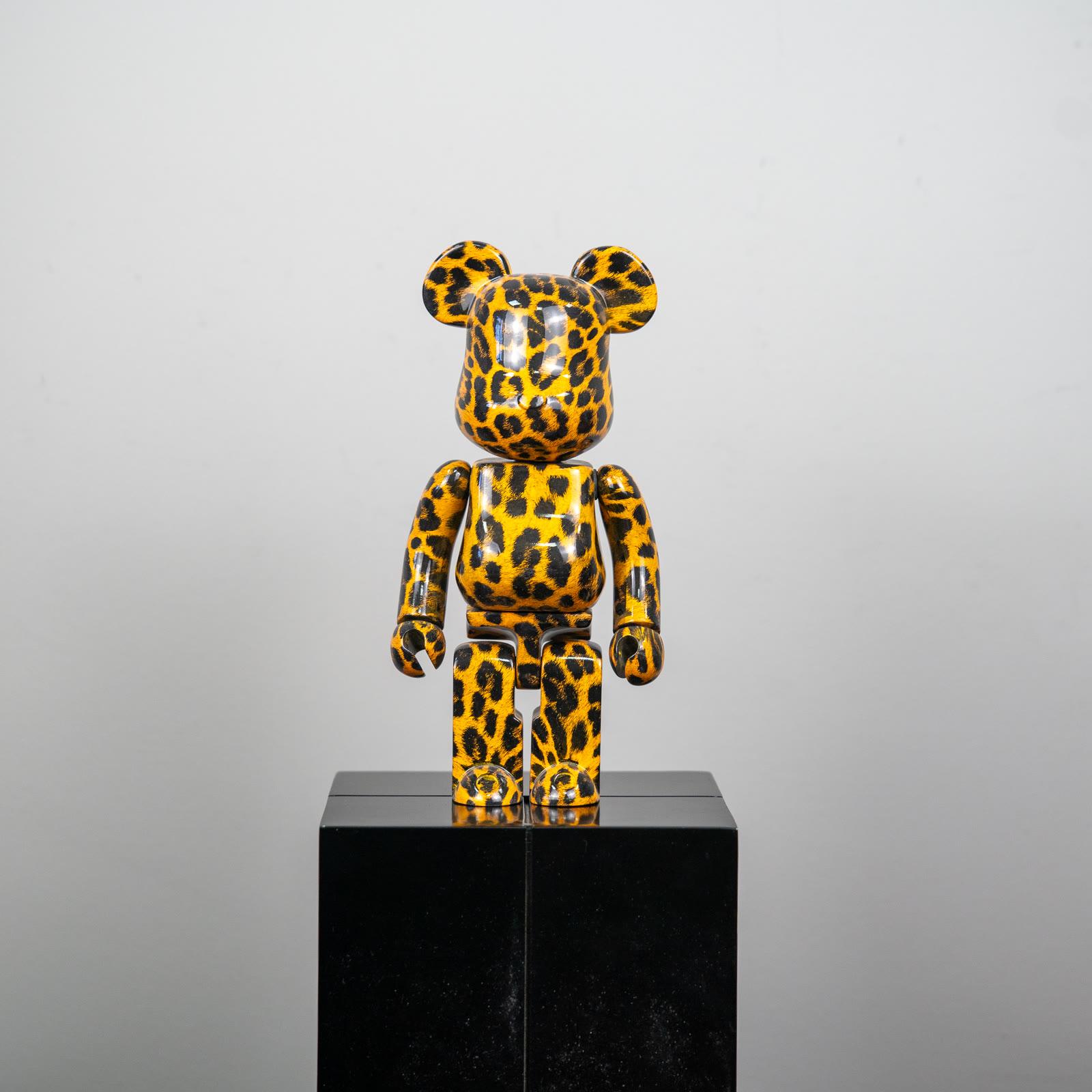
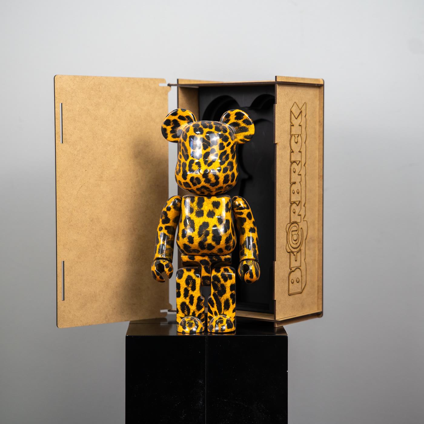
The word canvas does not promote every printed figure into a painting. It says the surface can be changed. The comic-print bear figure lays contour, frames, and a dot structure over this body. The glossy leopard-print bear figure carries a rhythm known from fashion onto the same silhouette. Both are decorative pieces in the Popüler Sanat catalog.
The distinction does not make looking poorer. It makes it easier to see what the print is doing. Instead of searching for a brand sentence, the eye follows how the line turns, where the dot tightens, how the pattern breaks at a joint. What pop art is holds the historical ground of that way of looking.
How does comic language sit on the figure?
Comic language sits on the figure as heavy contour, a repeated dot, and the feeling of a frame. This language is not the distance of a printed page. It is a surface rhythm that can also be read from close. The cylindrical torso carries the pattern without a break. The block of the arms and legs divides it. The division does not have to look like a fault. The joint leaves a breath, something like the fold of a page.
Pop art had already used this rhythm on canvas. Roy Lichtenstein enlarged the comic panel and made the dot and the contour the actual material of the picture. A print on a bear figure is not a copy of that history. It is the same visual grammar remembered on a three-dimensional body that can be repeated. To compare is not to belong.
No particular hero’s name appears in this piece. It does not appear because the catalog does not offer a license document. Comic aesthetics can be read apart from one publisher’s character: a black line, a flat field of color, a dot, a frame. Those four elements show that the surface looks toward popular print. They do not show who holds the rights.
What does a fashion pattern look for on the same body?
A fashion pattern looks for recognition on the same body. A leopard spot is a sign that can be read without an explanation. When it lands on the bear, it does not build a new animal story. It carries a rhythm known from clothing, bags, and print up to the scale of a small sculpture. A gloss finish says that rhythm even louder in the light.
Art toys, fashion, and music tells the wider version of this crossing. What is enough here is that the pattern turns the figure into a quotation from the runway. A quotation is not a collaboration with a fashion house. A catalog piece does not carry a claim that stands in for that collaboration. The pattern remains a decision about the surface.
At home, the decision is used with measure. If leopard print asks for a second animal pattern, or a second glossy contrast, beside it, the room scatters. Alone, on a plain ground, it still shows the cylinder of the body. Fashion’s language then stands as a texture, not as a costume. Texture can be looked at every day. A costume tires quickly.
How does repetition bring art and pop culture together?
Repetition brings them together because the same body can be rebuilt with another image. The art side is the displacement of a familiar image onto another scale. The pop-culture side is that the image was already in circulation. The block bear offers a neutral stage for the meeting. Because the stage stays neutral, the image comes forward.
Repetition also produces the feeling of a series. When a comic surface and a leopard surface stand side by side, both are read less as a bear than as a publication. That lets a collection be seen as a family of prints, not a family of characters. A family of prints does not need a list of licenses. A shared silhouette and a changing ink are enough.
The danger starts where repetition is counted as value by default. Being widely printed does not mean a surface suits the room. Being rarely seen does not make a piece more correct. This article uses no sales counts and no invented remarks. The job of repetition is not to inflate value. It is to make comparison possible.
Which confusions are common in this area?
The first common confusion is to take every printed bear for an artist collaboration. Collaborations hold an important place in the culture of the Medicom figure. That importance does not turn every pattern in the catalog into a collaboration document. A surface can recall a visual language. Recalling is not a signature or a contract.
The second confusion is to take a comic aesthetic for the right of one particular hero. Contour and dot do not belong to a single character. They are a shared grammar of printed culture. Whether or not a name, a logo, or a hologram appears on the piece, one mark does not prove the identity of a production.
The third confusion is to mix a pop-art reference with size. 100% at 70 mm, 400% at 280 mm, and 1000% at 700 mm are Medicom’s published system. Other percentages exist. These numbers do not increase the artistic weight of a print. Catalog photographs are not labeled with these percentages either. Image and height are separate questions.
How is a printed figure watched at home?
A printed figure is watched at a distance that gives both the silhouette from far away and the ink from close. From the door, the bear should be picked out. Seated on the sofa, the frame or the dot should not dissolve. If both fail, the place is changed before the piece. If a comic surface stays like a small blot, it is too far. If leopard print stands like a shout, it is too close, or it is taking too much light.
Light is both an enemy and a friend of print. Side light lifts the contour. Hard light from above whitens the gloss and erases the dot. Direct sun tires color over time. This is not a promise about value. It is a plain care note for readability. The detail stands separately under display and care.
The pop art selection shows the same grammar outside the figure as well. The bear is not the only carrier of that grammar. Thinking of it beside a poster, a print, or another sculpture keeps the canvas idea in its place without inflating it. The Bearbrick selection is a calm place to compare the comic print and the leopard on one shelf.
What do you do with the canvas idea?
The most honest use of the canvas idea is to choose the surface as a rhythm, not as a claim. If the comic rhythm makes you want to look from close, that print works at home. If the leopard rhythm presses down the rest of the room, another ground is looked for. Both are a legitimate taste. Neither needs a sentence about a license.
The form of 2001 produced the emptiness that makes this taste possible. Emptiness does not make every filled surface an official continuation of that form. The catalog pieces at Popüler Sanat are decorative figures that look toward the visual language of pop culture. Tying them to a more signed past than they have spoils both the pleasure of the print and the limit of the history. When the limit stays, looking becomes free.