
Why did the form travel so far?
The form traveled far because it can be learned in one glance and can carry another image on the second. The BE@RBRICK that Medicom Toy introduced in 2001 is a bear with a cylindrical torso, round ears, a simple face, and articulated block limbs. That scarcity made the figure readable both in a toy vitrine and in talk about art and fashion. People could meet a new surface without memorizing a new anatomy.
This piece does not tie that circulation to a number. There is no sales count, ranking, market share, or invented remark. Popularity here is not a chart of feeling. It is a structural account of why the form changed hands. How the culture formed tells the same story from the side of a community. Here the subject is the form itself.
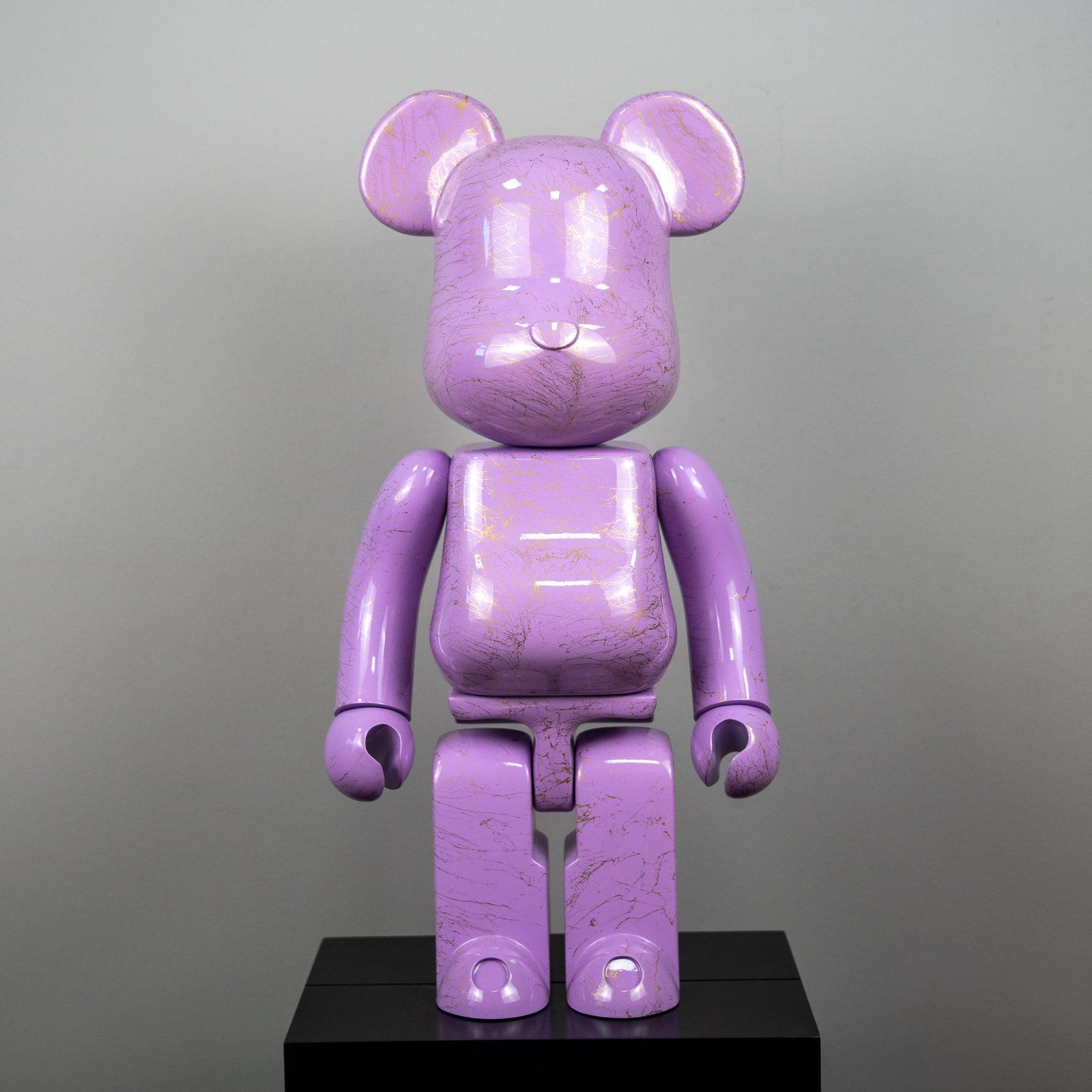
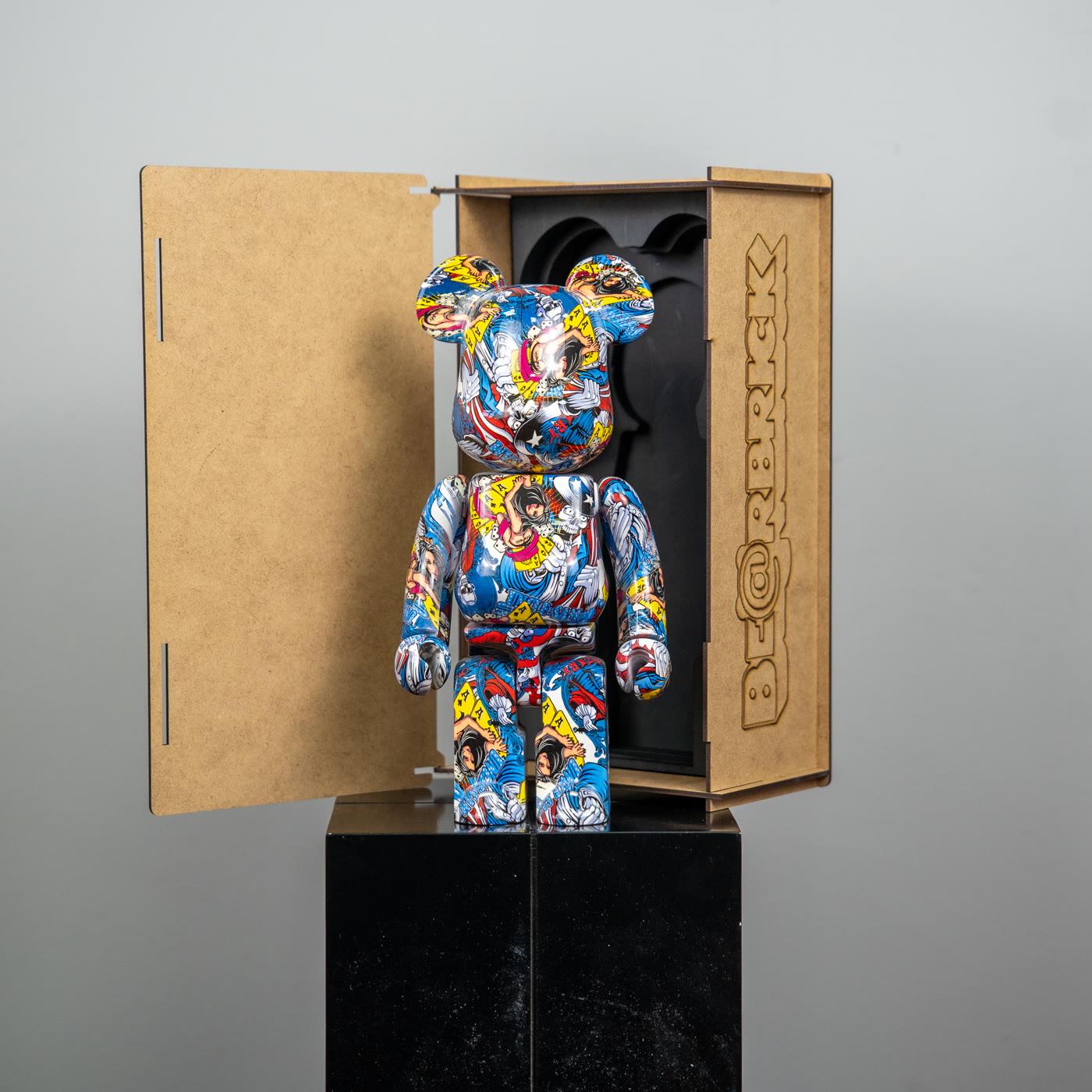
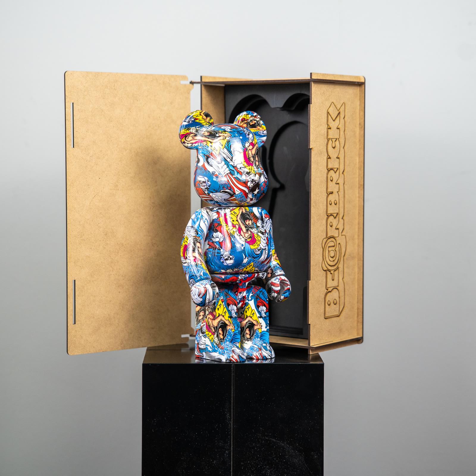
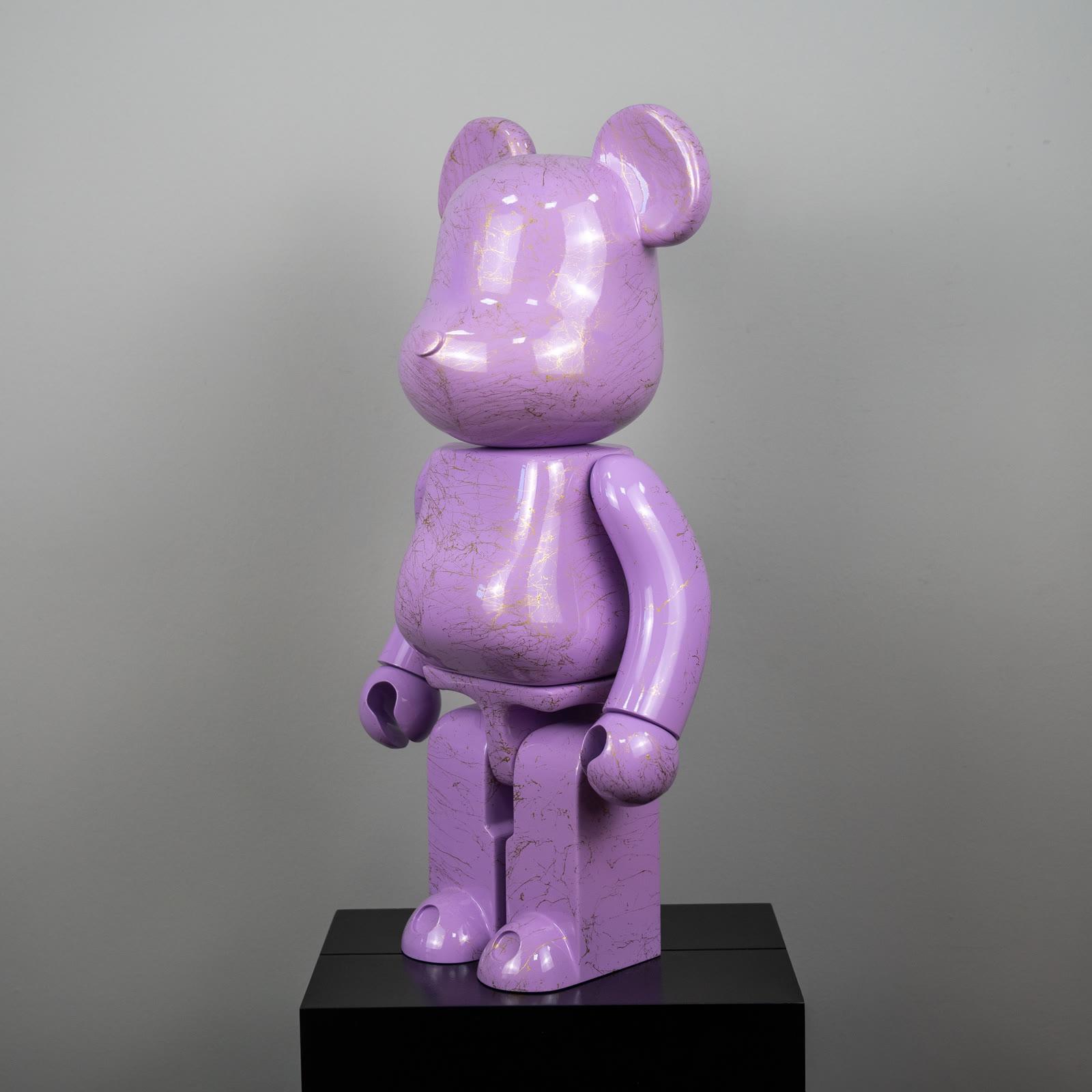
Popüler Sanat is not the authorized historian of this circulation, and not a Medicom dealer. The glossy purple bear figure with gold marble pattern and the comic-print bear figure in the catalog are decorative pieces that look toward the same silhouette. Their photograph is not proof of popularity, a percentage, or a license.
Why does the silhouette stay in memory?
The silhouette stays in memory because it can be reduced to three shapes: one cylinder, two circles, four blocks. The eye separates that trio even in a crowd. A detailed character becomes a blot from far away. The block bear, from far away, is still a bear. That is a trait that serves a poster, a shop window, and a small photograph.
Memory strengthens with repetition. See the same body in another color and the mind does not learn a new object. It records a new state of a familiar one. Popular culture already works this way. A frame people know takes a new image inside it. Popular culture and art tells the wider version of that frame.
The quiet of the silhouette matters too. Because the face does not shout, the figure does not enter every room in a mask. A purple marble pattern, a comic print, or a plain gloss is written over the same neutral stance. The stance stays fixed, so the change is read as surface. That is what makes a series possible.
Why was the surface used like a canvas?
The surface was used like a canvas because the body was free of the recesses that would break a print. The cylinder lets a pattern travel without interruption. Joints exist, but the face stays plain. A graphic, a fashion pattern, or a single color does not get lost in that plainness.
A gold marble pattern on a purple ground is a colored version of this canvas. A comic print is a canvas of frames and dots. Both are domestic examples of the relation in art and popular culture. No license for a particular hero is claimed. The print shows a decision about the surface.
The canvas comparison does not promote every figure into a work of art. The comparison says the surface can be changed. A changeable surface is open to collaboration and to series. Being open does not mean every print has the same weight. Some surfaces stand as a blot from far away. Some stand as a page from close up. Putting both on the same shelf with the same expectation misleads.
How did the scale language help it travel?
The scale language helped it travel by letting the same idea fit both a desk and a room. In Medicom’s published system, 100% is 70 mm, 400% is 280 mm, and 1000% is 700 mm. Other percentages exist, and the millimetres in between belong to the current chart. The small height builds a language of gifts and shelves. The large height stands in a lobby like sculpture. Because the same name could live two lives, it entered more doors.
This help does not automatically assign a height to catalog pieces. Popüler Sanat images are not labeled 400% or 1000%. Scale here explains why the form could be seen in different rooms. The centimetres of a particular product are looked for on its own page, and with a tape.
Scale also made conversation easier. Even when color was hard to describe, a person could show the difference between 100% and 1000% with a hand. A shared dictionary of measure made a scattered taste speakable. The dictionary is not a method of verification. It only explains why so many people could build the same sentence.
Why was the timing favorable?
The timing was favorable because, in the early 2000s, character, fashion, and street image were already passing through one another. A figure, a garment print, and a record sleeve could sit on the same table. The block bear sat down at that table without having to add a new personality. It carried visual languages that were already there.
A favorable time does not mean an inevitable victory. Other forms circulated in the same years. Some stayed. Some went quiet on the shelf. What stayed with BE@RBRICK is the scarcity of its anatomy and the openness of its surface. Those two traits made it hard to lock the figure to a single season. When the season passed, the silhouette was still recognized.
The same traits work now. A purple marble pattern can read like a jeweled surface apart from the color of the year. A comic print can carry the rhythm of printed culture without being tied to a particular issue. Being current does not have to bind the form’s popularity to a graph. Being current is the surface still being readable.
What gets built wrong around popularity?
The first sentence built wrong is that what is popular is what is official. A circulating silhouette does not make every example a Medicom production. The purple-marble-patterned figure and the comic-print figure in the catalog sit in the visual family of that circulation.
The second sentence is the wish to prove popularity with a count. If the count is invented, the piece collapses. The travel of the form can be told without counting: speed of recognition, openness of surface, a dictionary of scale, an anatomy that does not lock to a season. These four headings are not a statistic. They are a list of reasons.
The third sentence is that popularity can be confirmed by a single mark. A logo on the foot, a box, or a hologram does not, on its own, prove what a piece is. A crowded affection does not hand out identity papers. The pop art page shows, with other examples, how recognized images multiply. Multiplication is not enough to tie every copy to the same origin.
What is this account for, when you choose?
When you choose, this account turns excitement into the job of the form. If you like the silhouette, it will be read from far away. If you like the surface, it wants a place that is also looked at from close. If you are curious about scale, you learn Medicom’s chart and you do not force a catalog piece onto it. The four reasons are a filter, not a slogan for buying.
The popularity that works at home is not that other people recognize it. It is that you still want to look in the second week. Is the purple marble pattern still good in evening light? Does the comic frame feel crowded on the shelf? The answer is personal and needs no number. The journal keeps the culture, size, and care of the same form beside this filter.
The form traveled because it could say little and carry a great deal. That is an uncommon design trait. Being uncommon does not make every bear you meet part of that design. Liking it while keeping the distinction leaves room both for the idea of 2001 and for the piece in the room.