
What does a bear figure do in an interior?
In an interior, a bear figure works as a focus that sets a familiar silhouette inside a quiet room. The cylindrical torso, round ears, and block limbs read from a distance. That readability lets the piece behave like a small standing mass, rather than like a poster or a vase. If the room turns around it, the figure becomes furniture. If the room leaves it on a shelf, the figure keeps company.
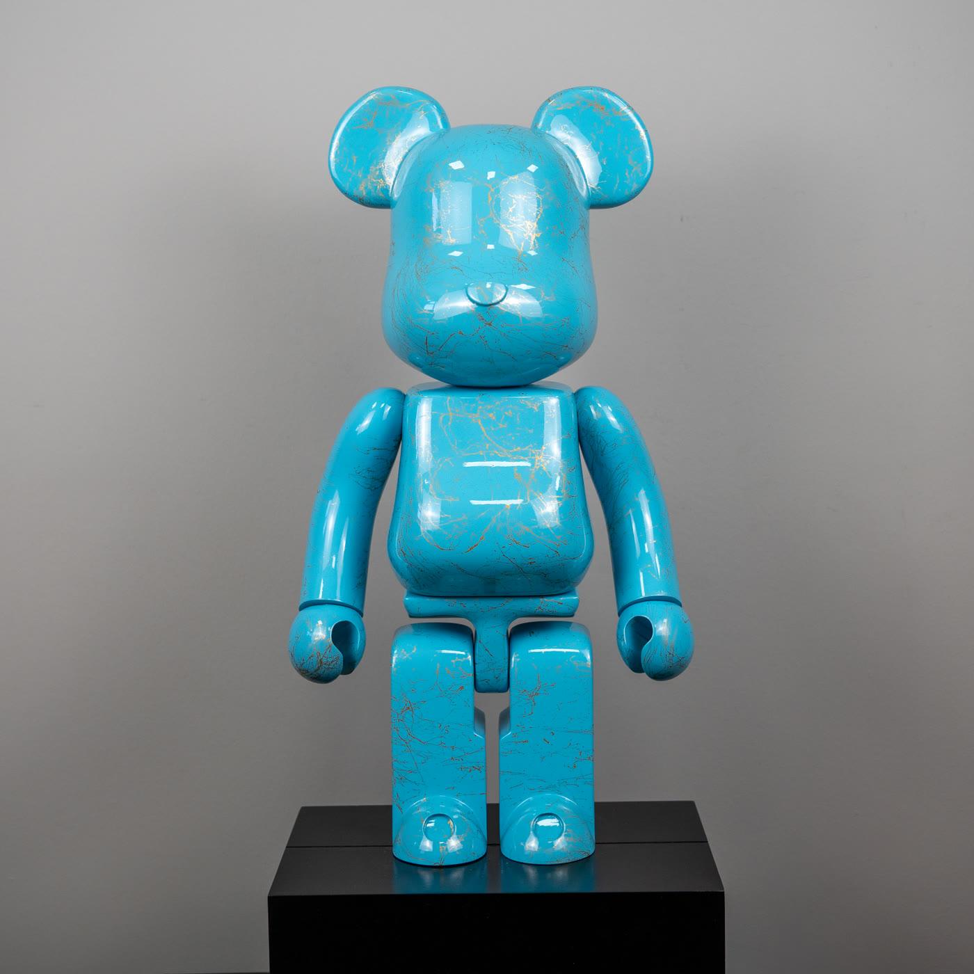
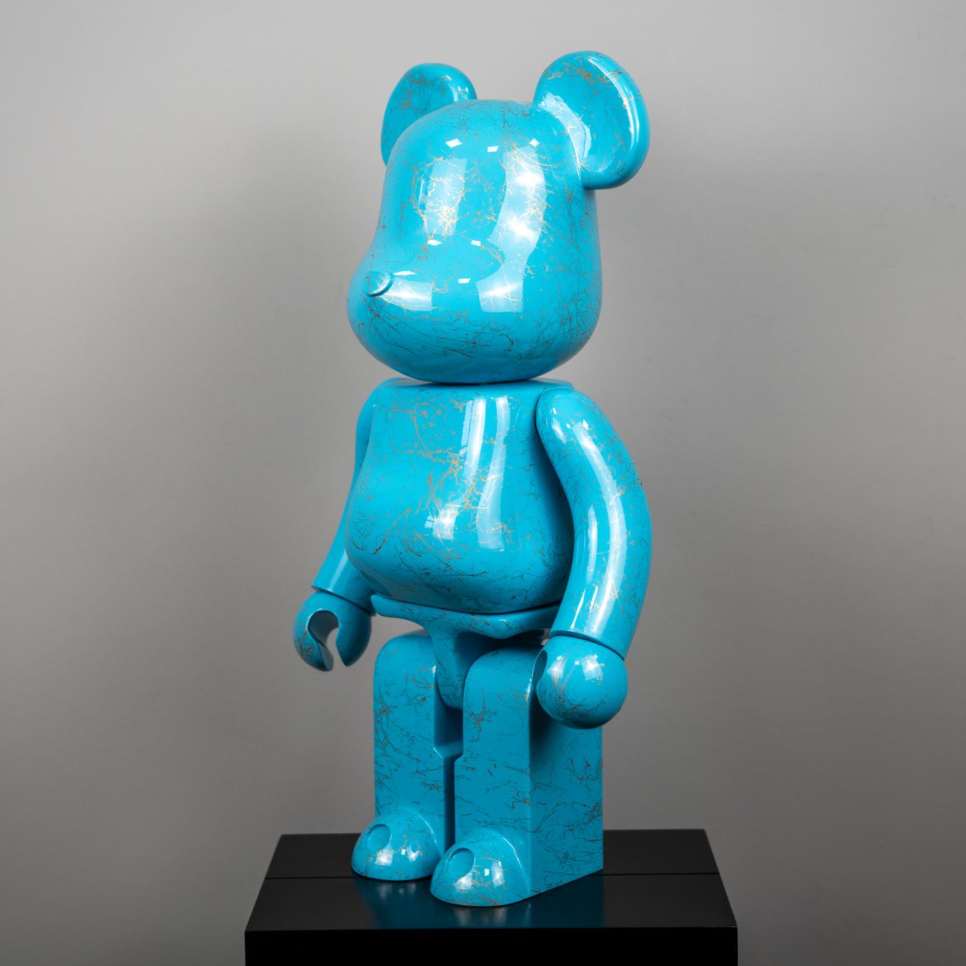
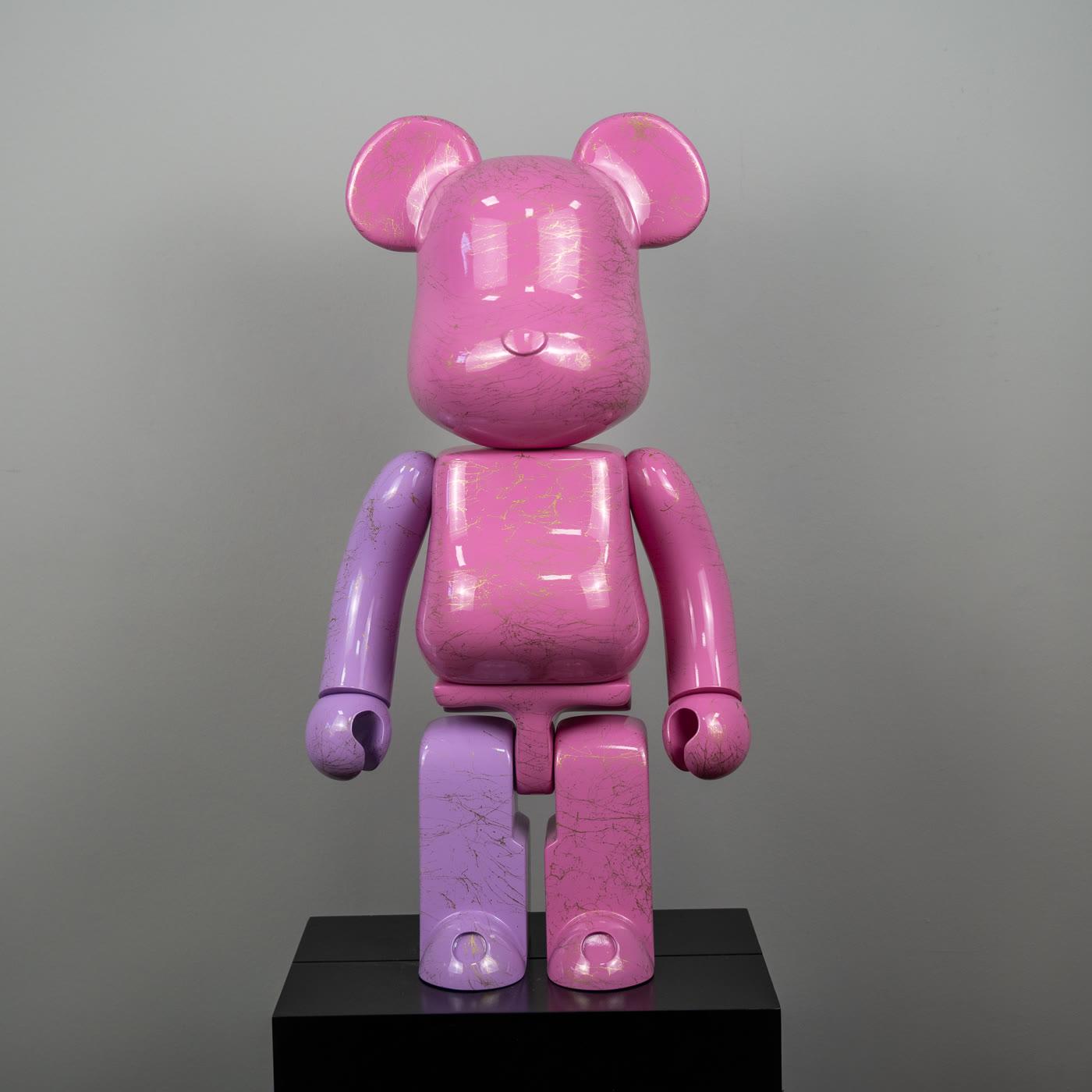
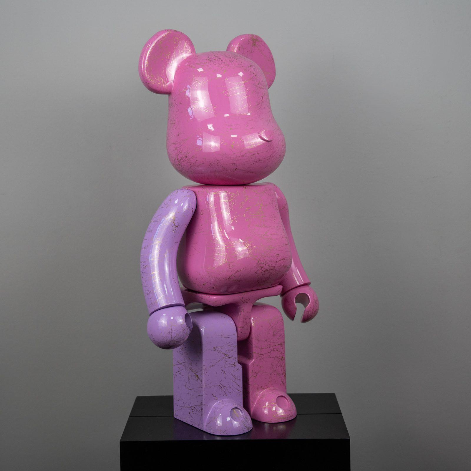
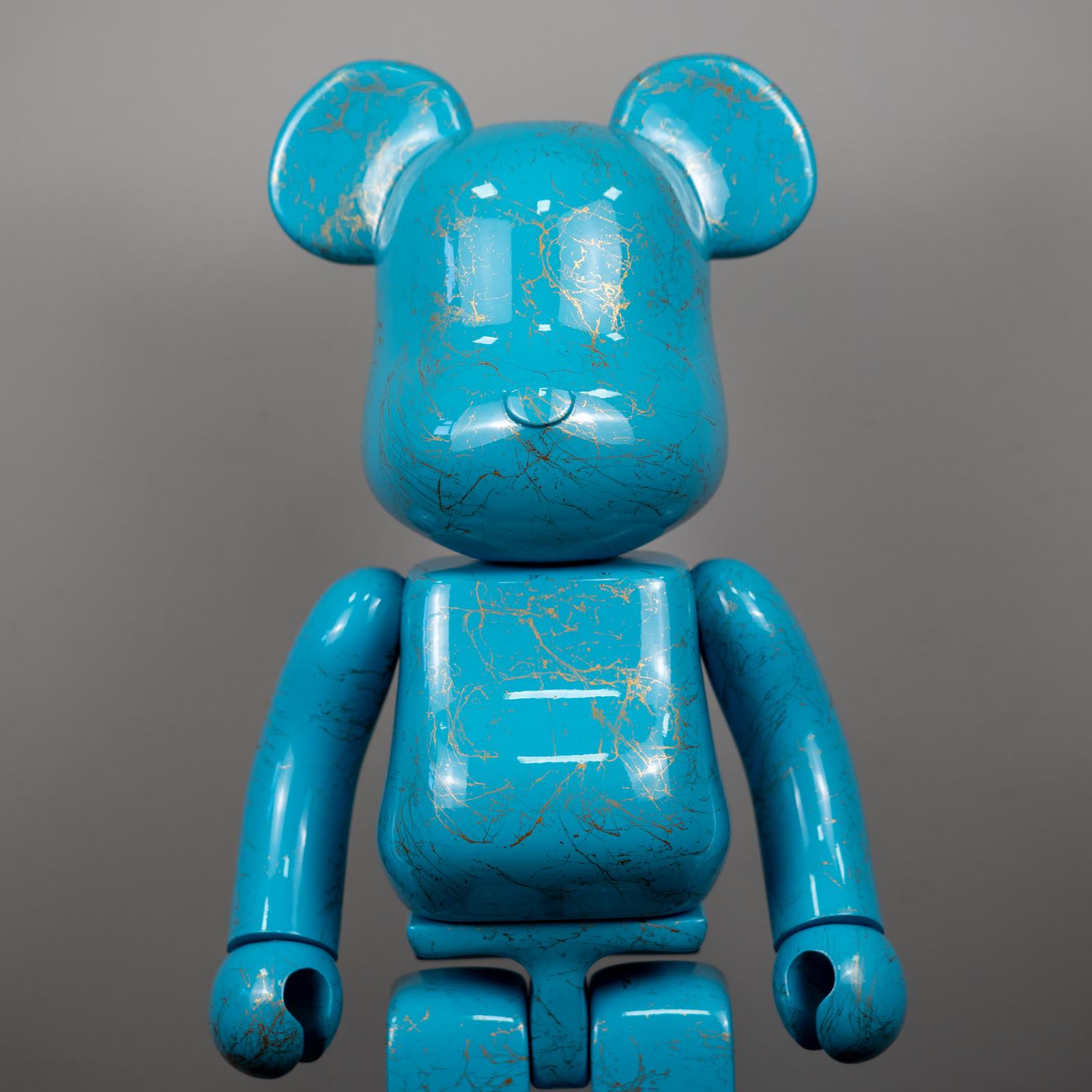
BE@RBRICK is the name of this form, introduced by Medicom Toy in 2001. A note on interiors does not hand out percentage badges either. The glossy turquoise bear figure with fine gold marble pattern and the bear figure in pink and purple tones with gold marble pattern are discussed as color decisions. Their heights are not announced as Medicom’s 70 mm, 280 mm, and 700 mm.
What works indoors is stance, not the name. The figure is chosen to build a point where the gaze can rest, not to fill a corner. A figure in the living room thinks about that point together with seating. Here the subject is how the bear form sits on that point through color and finish.
Why is one finish enough in most rooms?
One finish is enough in most rooms because the block bear already has a strong contour. A second loud voice enlarges the noise, not the contour. A glossy turquoise body may not carry another saturated color beside it. A surface that already holds pink and purple together wants its neighbor to stay plain.
One finish does not have to mean a minimal room. A wood console, a linen sofa, a flat wall already frame the figure’s color. Minimal color tells how that frame is built. The bear figure enters the frame as an accent. The accent is not there to change the whole palette.
If more than one figure is placed, staying in the same family gives a calmer result. Two marble-patterned surfaces can stand side by side if air is left between them. If one is turquoise and the other pink-purple, the shared thing is the gold line. The shared line makes the two colors kin without a fight. If there is no shared line, giving one of them another room is the more honest solution.
What do marble pattern and gloss do in the light?
Marble pattern and gloss give light back as color. A fine gold line carries a thin warmth at the right angle. A hard spot from above turns the same line into a white stripe and tires the turquoise. If the light arrives from the side, or slightly above, and stays indirect, the marble pattern can be read and the surface does not become a mirror.
Pink and purple tones do not stay the same in daylight and in evening light. They can look lighter in the morning and denser at night. That is not a fault. It is the nature of a glossy surface. Placing the figure for the hour you actually sit there is more accurate than placing it for a vitrine photograph.
The front of a window is not a kind place for these surfaces. Direct sun can tire the gloss over time and fade color. Light that slips past a curtain is enough. The claim of protection is not exaggerated here. The point is not guarding value. The point is keeping the surface readable.
Where does the figure rest easily?
The figure rests easily where its silhouette is not cut. The middle of a console is good if there is air on both sides. The heart of a bookcase is good if the top shelf is not stuck to the ceiling. The exact middle of a coffee table is often poor, because the gaze strikes it every time and the table stops being usable. The bear is a guest of a surface you look at, not a worker of a surface you use.
Height has more to do with the gaze than with size alone. In a living room viewed while seated, a console at eye level is kinder than an entry viewed while standing. The form described in what a BE@RBRICK is helps here: the ears sit on the cylinder, and if they are cut from above the figure stops being recognizable. Air above matters as much as color.
The floor is also a choice, though not every piece is a floor figure. A large mass stands outside the path, on a level and stable point. A small piece disappears on the floor. A catalog image hides this distinction in studio emptiness. At home the door, the edge of the rug, and the socket come into play. You do not go down to the floor without measuring them.
Which assumptions mislead in decoration?
The first assumption is that a bear figure belongs only in a closed collection room. The form also stands in a quiet living room and in a work corner. Collecting language does not have to fall silent at home. It does not have to shout either. A single piece, in the right place, stands without doing either.
The second assumption is that more color means more character. Turquoise is already a decision. Pink with purple is already a decision. A third pattern increases scatter, not character. When an interior loads the figure with more story than it can carry, the silhouette steps back.
The third assumption is to take a catalog piece for a Medicom percentage or an official series. A decoration decision does not need that. It needs the color to get along with the room, and the gap to be measured. A logo, a box, or a hologram does not build that getting-along on its own. Decorative pieces stand by the same principle in forms other than the bear.
Which three checks come before placement?
The first check is the ground. Is the surface level, is it too close to an edge, is it where a daily hand will strike? If a glossy bear falls from an edge, marble pattern and finish are harmed together. Bringing it in by a few centimetres does not break the composition.
The second check is the neighborhood. The glass of a frame, the metal of a lamp, and the black of a television write a second reflection onto a glossy surface. Turquoise takes those reflections in as color. A quiet wall leaves the marble pattern to itself. Reducing the neighbor corrects the room without changing the figure.
The third check is viewing distance. Is the silhouette picked out at the first step from the door, and is the marble pattern still readable when you sit on the sofa? If both fail, the place is changed, not the piece. The Bearbrick selection stands for comparing colors. The choice is repeated in the room’s own daylight.
What should the room expect from the figure?
The room does not expect a scene from the figure. It expects a stance. Turquoise can remain a cool accent. Pink and purple can remain a warm note. The two together do not have to run the whole house. A console, a gaze, a quiet ground are enough for most homes.
The history of the form does not inflate that expectation. The block bear introduced in 2001 did not arrive as a character costume ready for interiors. It arrived as an open silhouette. The home gives that silhouette its own light and its own gap. Seen beside other sculpture in the collection, the bear figure reads more clearly as a companion to the room. The right place stays useful longer than the right name.